0 members and 17,662 guests
No Members online

» Site Navigation

» Stats
Members: 35,442
Threads: 103,075
Posts: 826,688
Top Poster: cc.RadillacVIII (7,429)
|
-
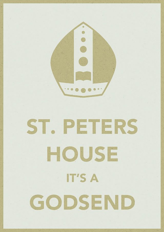
 A2 poster and illustrations A2 poster and illustrations
These are bits of university related work that I've done in the past few days.
My response to a live brief asking us to create an A2 poster to promote my art school's library - based on the ever-so-popular KEEP CALM AND CARRY ON poster and treated to look like blue screen print on brown paper.
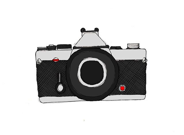
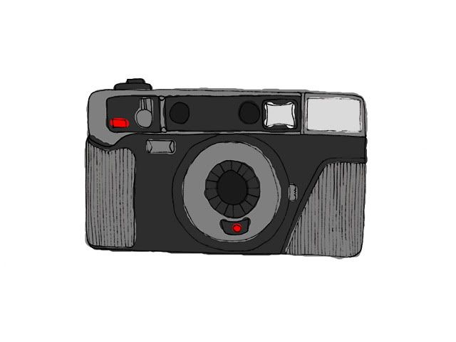
2 pen and digital illustrations of 2 of my cameras for a grid based layout brief - the illustrations are the only thing I actually enjoyed about my final layout and I want to continue the series by drawing the rest of my camera collection in the same style.
-
Nice linework man  Not too keen on the poster however, but that's just my personal taste. Not too keen on the poster however, but that's just my personal taste. 
-
 Originally Posted by iScribble.

Nice linework man Not too keen on the poster however, but that's just my personal taste.
But it is still competently executed, one can't deny that. Good work on that poster.
-
i dunt particularly understand the poster, but anything religion-related (or something that i interpret as being religion related, whether it is or isnt) makes my brain shut down... for the most part i understand the hat and i like the lil book in it, but meh... the colors are weird... boring. and the hat looks squished >.> (it is a hat right?)
the camera pix are awesome, just a little bland. maybe put a background with a similar sketchy style... i dont really know why but when i see the second camera it makes me think of a Parisian outdoor café (you know... wrought iron lace tables, a cup of espresso, pink overhangs and the Eiffel Tower in the background) >.> please dont ask why cause i really have no idea.....
good work tho ^.^
-
But it is still competently executed, one can't deny that - Soap
Oh I'm not denying that just saying the poster isn't to my taste
-
-
Originally Posted by Eleventee
Thanks guys
The poster isn't really religious as such, it's a semiotic play on the name of the library (which is St. Peter's Library). St Peter is well known for being well read and is often depicted with a book and a key (which denotes that reading is the key to knowledge) so using the library's religiously based name as a starting point I used the image of the mitre (which is the Pope's ceremonial hat) to take the place of the British crown on the original keep calm poster to represent a symbol of power - a relation to the phrase "knowledge is power". The colours are obviously a personal preference, I like them myself and brown and blue are a well known and generally effective combination. I do appreciate what you've said though and it's made me think; a poster should be almost instantly effective at getting across it's message and if you didn't understand it then that means other people won't either, which in turn means that my poster isn't doing it's job properly!!
I think you're on the right track with that. Yeah there are a lot of good messages to be found in the poster itself, I mean you wrote a whole paragraph on what you meant it to be interpreted as. But the way I felt about it, there's so much that people would have to know and understand to be able to gain anything from the poster itself. Granted the poster is probably going to be displayed at the school, where art students will see it, and most likely get most of the messages. People here, however, probably wouldn't be as prone to picking those pieces out and putting them together, IE the name of the library, and the separate items of information that go into the actual hat.
I think you did a good job though. In terms of minimalism, you hit the nail on the head. If you want me to be perfectly honest, the poster is for an art school's library, which means we aren't your target audience. So suffice it to say we probably aren't the best group of people to base your critique on as far as how effective the poster is message-wise. :P
I wasn't going to post because I didn't want to seem shrewd or get in the way, but I like your reasoning, so I figured I would let you know. :P
Nicely done elev.
Last edited by Chris; 02-19-2010 at 12:38 AM.
-
holy CRAP a lot of religious speak O.O
the following is just random speak that should not be reguarded with any significance to it at all  (i'm tired, sick and exhausted and i dont know 50% of what i'm saying) (i'm tired, sick and exhausted and i dont know 50% of what i'm saying)
see the problem for me and virtually every person i know, i have no idea about saints and what was so special about them, and its really a disadvantage because i miss a lot of literary allusion because of my lack of knowledge, and i dont get as much out of all types of art because of it. i mean i understand how the image has a religious meaning, but i dont see how it connects to the library very well, other than through the name. my school had (it got burned down by some bastards) a building called the Mother Goose building, because originally it was the preschool building, which then turned into the freshman-hangout/blockhouse. it was known as the mother goose building cause it was literally the place where every single freshman hung out at, all 100 of them crammed into a 150-year-old house-converted-into-classrooms with 4 rooms, two offices and two (mildly traumatizing) bathrooms (one toilet and a sink...) so that name speaks something to me because it connects to what happens inside the building. on the other hand, i dont see how "st. peter" (i totally almost called it st. arthur...) connects to a building. i know this is probably offensive, but if i think of a library with a religious connotation, i think of a librarian (glasses on a chain, sharp nose, pursed lips, hair in a bun, skinny wearing a grey long grey dress or skirt) peering down from a cloud, holding like Shakespearean works with a halo and wings. i just imagine kindof like students pleading for help on their knees up to her with like essay assignments with due dates saying "TOMORROW" in red ink in their hands... i hope i didnt offend anyone in some religious way by saying that?? idk... i'm scared of hurting peoples feelings out of ignorance of religion quite often >.>
xP
-
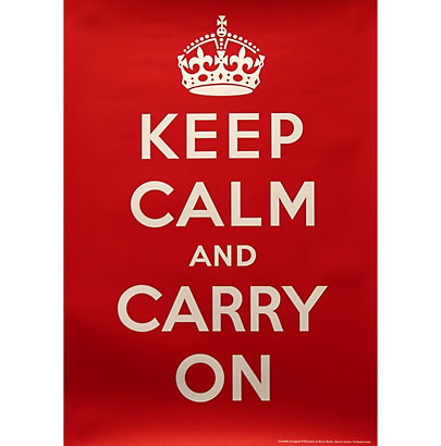
The poster doesn't have a religious meaning, it has a literary and design history-based meaning. It's a revamped more personal-to-my-school version of this poster from WWII:
The crown is replaced by the mitre because it symbolises the religiously based name of the Library and the book inside the mitre represents not only St. Peter but also the fact that a Library inherently has books inside it. The text relates to the image by using the word "Godsend" but also relates to the Library because in times of educational need, it is a fantastic resource.
To answer your question as to why the Library is called that is because it is next to a giant church called St. Peter's Church, and the building the Library is now occupying used to be the Vicarage - Therefore it was the Church of St. Peter's House. The Library itself isn't religious, it's the primary Library for the School of Arts at my university and houses books, magazines, slides and other ephemera about art, design, photography, fashion and 3D materials as well as all other creative media. As Solaris said, because you don't attend this university, particularly the specific School the poster caters for, then you will probably find it difficult to relate to, but I hope I've cleared up any misconceptions you had.
-
i get it now ^.^
i also feel like a dumbass nao but THATS OK cause i learned somethin today >.>
thanks for putting up with my lack of common knowledge
Similar Threads
-
By Scrib in forum The Void
Replies: 222
Last Post: 02-06-2011, 10:23 AM
-
By mapyl in forum Digital Art
Replies: 2
Last Post: 01-17-2010, 10:30 AM
-
By Krimsyn in forum Digital Art
Replies: 19
Last Post: 01-14-2006, 06:13 PM
-
By Spikee in forum Digital Art
Replies: 8
Last Post: 10-12-2005, 11:14 AM
-
Replies: 4
Last Post: 07-08-2005, 01:51 AM
 Posting Permissions
- You may not post new threads
- You may not post replies
- You may not post attachments
- You may not edit your posts
-
Forum Rules
|


 Reply With Quote


