GFXVoid Graphic Design Forum

Remove Text Formatting
Loading...

» Online Users: 3,497

0 members and 3,497 guests
No Members online

» Site Navigation

 > FAQ

» Stats

Members: 35,442
Threads: 103,075
Posts: 826,688
Top Poster: cc.RadillacVIII (7,429)
Welcome to our newest member, Lekelindids
Results 1 to 10 of 10
  1. #1
    Join Date
    Jan 2010
    Posts
    2,599

    Default Sig for my friend


    CnC please?
    I dont make sigs anymore

  2. #2
    Join Date
    Sep 2008
    Location
    Currently Melbourne Australia
    Posts
    222

    Default

    Whoa that is really awesome. I like the effects.. But the colours are a bit messy and the text should be moved nearer to the focal.

  3. #3
    Join Date
    Jan 2010
    Posts
    2,599

    Default

    here is v2


    I forgot to move the text.. oh well..
    I dont make sigs anymore

  4. #4
    Join Date
    Sep 2008
    Location
    Currently Melbourne Australia
    Posts
    222

    Default

    Yeah I feel this ver is better but it needs some dodge/burn

  5. #5
    Join Date
    Jan 2010
    Posts
    2,599

    Default

    ohh alright.. I'll try to make a v3 ;D

    EDIT: Here is v3!
    Last edited by schultz; 03-05-2010 at 07:38 PM.
    I dont make sigs anymore

  6. #6
    Join Date
    Mar 2005
    Location
    Georgia,USA
    Posts
    4,752

    Default

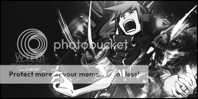
    i like the color version better imo i think its kind of a 1 sided tag tho i dont like all that different text i like the effects and the blending on it some of the colors look not dull but umm i dunno how to describe it but they dont pop like i think they should keep workin man


  7. #7
    Join Date
    Jan 2010
    Posts
    403

    Default

    I think it's great. Color version really does look a lot better. This is just a suggestion, but I don't like how sharp the effects on the left side look, compared to the right side it looks unbalanced, maybe blur the effects more?


  8. #8
    Join Date
    Jan 2010
    Posts
    2,599

    Default

    thnx for the Cnc underoath and kotora

    I'll try to change it//
    I dont make sigs anymore

  9. #9
    Join Date
    Jan 2010
    Location
    Guatemala
    Posts
    1,084

    Default

    gotta say v.1 looks amazing bro KIU
    Favorite and Most Recent:


  10. #10
    Join Date
    Mar 2010
    Location
    OMG i forgot
    Posts
    183

    Default

    V.1 was better, the colors where a bit too clear but its nicer with colors
    And gotta love the c4d's But you should have scree or overlay them a bit, or just dont put it on your render! Overall 8/10!
    iQ*

    Never forget you are special. Just like everyone else<3

    .................................................. ..................................


    Gifts:

Similar Threads

  1. A little something for my friend.
    By Ben94 in forum Sigs & Manips
    Replies: 0
    Last Post: 08-17-2006, 07:46 PM
  2. Hmm..just a sig for a friend...
    By Nempthys in forum Sigs & Manips
    Replies: 5
    Last Post: 08-08-2006, 07:44 AM
  3. Sig for a Friend
    By Frost in forum Sigs & Manips
    Replies: 4
    Last Post: 07-10-2006, 11:16 AM
  4. Sig for Friend
    By Heavens-Exile in forum Sigs & Manips
    Replies: 3
    Last Post: 03-29-2006, 03:45 PM
  5. For a friend...again
    By silenced in forum Digital Art
    Replies: 2
    Last Post: 10-23-2005, 06:21 PM

Posting Permissions

  • You may not post new threads
  • You may not post replies
  • You may not post attachments
  • You may not edit your posts
  •  
Powered by vBadvanced CMPS v4.1.1