0 members and 685 guests
No Members online

» Site Navigation

» Stats
Members: 35,442
Threads: 103,075
Posts: 826,688
Top Poster: cc.RadillacVIII (7,429)
|
-
 Karate Kid >.< Karate Kid >.<
This turned out nothing like I had hoped lol....suggestions?
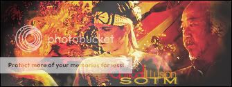
v2.
Stock used:
Last edited by OpticaliLLusion; 06-17-2010 at 09:17 PM.
-
to make the fire coming out of his hand stand out more dont make the rest of the sig the same color.
-
 Originally Posted by marioman77

to make the fire coming out of his hand stand out more dont make the rest of the sig the same color.
Yeah, creating a focal point is one of the key things I was having problems with with it...I might give it another shot later tonight. You can probably tell by the time I put the text on it, patience was non-existent. xD
-
i like the fire effect, it all seems over contrasted imo plus the quality looks kinda low, never create a tag if you get impatient with it or it wont work, you need to take time with creating tags, you need time to think about what would look good, id say start again, go with the same concept of the fire, but add more effects make the tag bigger so you have room to add depth and just keep at it  kiu! kiu!
-
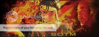
v2 added...last tweak with this one, gonna start over now xD
-
looks cool dude! i like the effects. imo i think the render should stand out a bit more
Similar Threads
-
By l PaNdEmOnIuM l in forum Sigs & Manips
Replies: 3
Last Post: 11-16-2009, 06:30 PM
-
By Suddu in forum Digital Art
Replies: 1
Last Post: 01-06-2009, 11:57 AM
-
By El-Ko in forum Sigs & Manips
Replies: 5
Last Post: 08-05-2005, 08:29 AM
 Posting Permissions
- You may not post new threads
- You may not post replies
- You may not post attachments
- You may not edit your posts
-
Forum Rules
|


 Reply With Quote