0 members and 26,370 guests
No Members online

» Site Navigation

» Stats

Members: 35,442
Threads: 103,075
Posts: 826,688
Top Poster: cc.RadillacVIII (7,429)
|
-
 Quickie Quickie
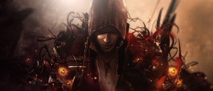
So I got a new laptop, decided to try out CS5 on it, gotta admit I love it. Anyway, I made this sig as soon as a found a render I liked and downloaded a few resources. The whole thing is about 16-18 layers lol, but like I said it was to test how my laptop runs PS.
Now that I look at it the lighting may be off just a bit, because of the light on his face, I'm not sure. Anyway..

-

the lighting is a bit off, however I really like how you used the c4d..making it look organic..symbiotic even.
-

I got to agree about the lighting being off. But I'm loving the c4d on the render, the depth particularly.
-

LS could be placed on the left to be more reasonable. Looks good nonetheless 
-

Alright, I couldn't take it anymore so I went and tried to fix the lighting. ;p

Does this work better? I still have it on the other side also, just low opacity.
-

i like the first one more and the only part i dont like about this one is the blurred c4d in the back
-

not too bad bud i like the effects and colors just need work on lighting placement but i have that problem to allot of times . kiu m8 nice looking tag
-

i think the reason the blur c4d now looks weird in v.2 is cause the light source helped blend it in when it was on the right maybe slightly eraser the blurred c4d a tad bit good sig nonetheless
Similar Threads
-
By Fork in forum Sigs & Manips
Replies: 12
Last Post: 01-23-2011, 06:52 PM
-
By Dale in forum Digital Art
Replies: 3
Last Post: 01-25-2010, 12:30 PM
-
By Dale in forum Digital Art
Replies: 5
Last Post: 11-06-2008, 01:35 PM
-
By Magnum in forum Digital Art
Replies: 5
Last Post: 03-01-2006, 10:29 AM
-
By nyve in forum Digital Art
Replies: 6
Last Post: 11-04-2005, 02:39 AM
 Posting Permissions
- You may not post new threads
- You may not post replies
- You may not post attachments
- You may not edit your posts
-
Forum Rules
|


 Reply With Quote


