0 members and 592 guests
No Members online

» Site Navigation

» Stats
Members: 35,442
Threads: 103,075
Posts: 826,688
Top Poster: cc.RadillacVIII (7,429)
|
-
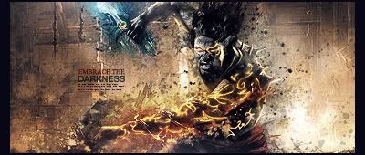
 Warrior LP Warrior LP
My first piece in about 3 months, been busy with exams. Has many messages 

My Newest
Making A Tutorial: Off Mail me if you wanna collaberate.
-
-
Nice one  but whats with his left hand ? is a hand from another guy? cause it looks weird and the collors are different but whats with his left hand ? is a hand from another guy? cause it looks weird and the collors are different
-
Yes. Arm looks weird. Also shadow is too solid.
-
Yeah shadow needs a bit more naturalness and the arm was rotated, it looked fine when it was a smaller magnification but i agree is looks messed in 100%
My Newest
Making A Tutorial: Off Mail me if you wanna collaberate.
-
I like it, but the arm is weird and you need more depth. Also the building in the distance is too sharp even though it should really have a slight blur to add more emphasis on the man.
Overall, I like the idea, with a few tweaks it'll be a very nice piece
-
I really love this. As others have said, the arm looks a little weird but that's my only gripe with this. I love the overall tone of the piece and the coloring is lovely! Everything is blended together really well and I love the overall feel of the whole thing.
Very well done, KIU!
-
warrior has jaggies, poor cut, should have been feathered. shadow is off, looks washed out..
Good concept though, fix the lighting.
Similar Threads
-
By +Josh Fx in forum Sigs & Manips
Replies: 6
Last Post: 06-08-2011, 02:25 AM
-
By Trauma in forum Sigs & Manips
Replies: 0
Last Post: 09-06-2009, 04:13 PM
-
By Victor76 in forum Sigs & Manips
Replies: 7
Last Post: 07-30-2009, 02:15 AM
-
By Squirt in forum Sigs & Manips
Replies: 3
Last Post: 07-01-2008, 11:13 PM
-
By Hellion in forum Sigs & Manips
Replies: 7
Last Post: 11-12-2007, 09:20 AM
 Posting Permissions
- You may not post new threads
- You may not post replies
- You may not post attachments
- You may not edit your posts
-
Forum Rules
|


 Reply With Quote