0 members and 26,370 guests
No Members online

» Site Navigation

» Stats
Members: 35,442
Threads: 103,075
Posts: 826,688
Top Poster: cc.RadillacVIII (7,429)
|
-
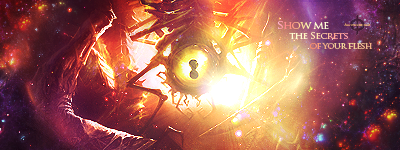
 most recent work most recent work


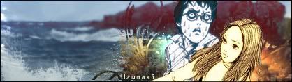
move your head around and the background shifts. tried to make the sig in 3D but i couldn't get it to look right


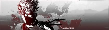


thanks to flammenfuchs on DA for letting me user her art
http://fav.me/d4e4k6t


Last edited by )85(; 01-23-2012 at 02:18 AM.
-
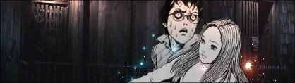
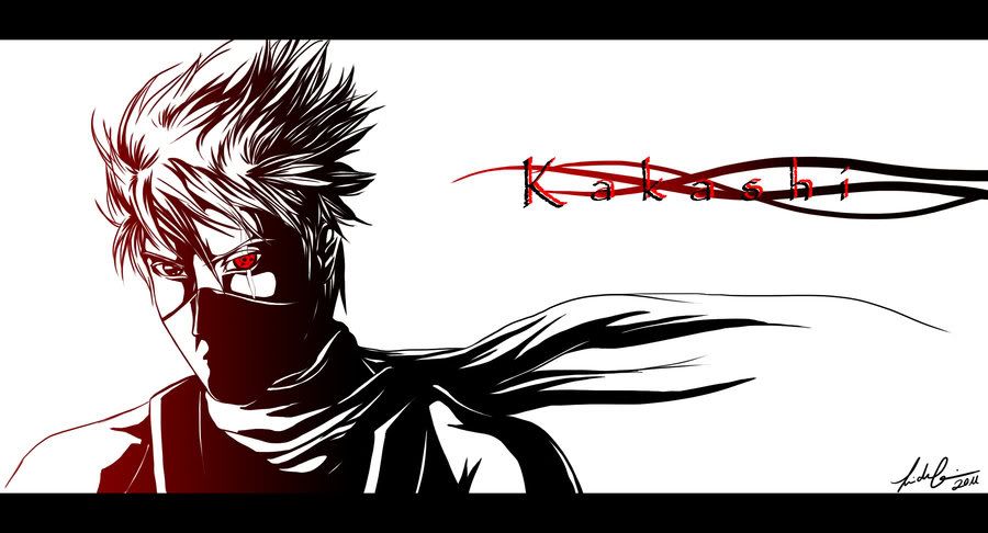
^^ this one is amazing, too bad you didn't make it, but whoever did did nice. Your sigs are pretty cool, like the progression, keep goin on them and kudos for asking permission to use someones art for a sig, not many do.
-
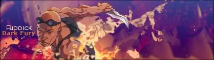
They got a lot better towards the end, I think it would be better if you used a larger size (350x150+).
For the top ones though I would work a little more on blending in the render.

One of the sexiest tags I've ever seen, from Radillac ↓ <3
-
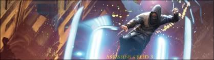
i tend to use 400x200 i was told thats the best for my type of work :/
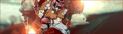
They say what goes up must come down but,
Don't let me fall
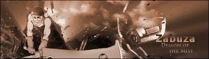
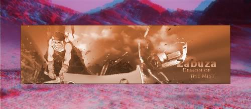
Latest Work
-
very nice tho i wana learn to be able to do stuff like that
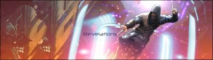
They say what goes up must come down but,
Don't let me fall
Latest Work
-
I enjoyed looking at these. It is like a snap shot of your learning process. I would definitely start using a bigger size as you will have a larger work area and you will be able to generate a lot more effects and get more out of them. Like Distelo pointed out you should spend a little more time getting comfortable with the blending options of your photo manipulation software.
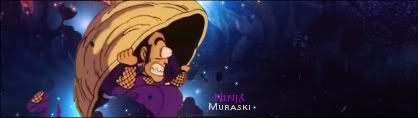
Thanks be to JDragon for the sweet gift.
-
 Originally Posted by cC.DOMINO

^^ this one is amazing, too bad you didn't make it, but whoever did did nice. Your sigs are pretty cool, like the progression, keep goin on them and kudos for asking permission to use someones art for a sig, not many do.
yush it's good work. -_- forgot to link her after i put my thanks
http://fav.me/d4e4k6t
when i made the image smaller i lost the definition in the eye.
Originally Posted by xX.Distelo
They got a lot better towards the end, I think it would be better if you used a larger size (350x150+).
For the top ones though I would work a little more on blending in the render.
once i started using 418x118 i've never used another size. it's not likely i'll make them any bigger. any tips on blending because i usually over due it.
Originally Posted by DemonksGFX
very nice tho i wana learn to be able to do stuff like that
all these are really simple if you look at them closely. i use a big image for backgrounds then use a splater smudge brush for the background add gradient maps along with gradient flares. once i got those in order i blur the background and add some text.
Originally Posted by Sioux
I enjoyed looking at these. It is like a snap shot of your learning process. I would definitely start using a bigger size as you will have a larger work area and you will be able to generate a lot more effects and get more out of them. Like Distelo pointed out you should spend a little more time getting comfortable with the blending options of your photo manipulation software.
i usually flatten the image then use the smudge tool. i used the eraser tool on the "revelations" sig but i've hardly done that option. any tips on how i could blend?
Similar Threads
-
By +cK Trix in forum Sigs & Manips
Replies: 5
Last Post: 07-20-2011, 01:53 AM
-
By Hoshiko in forum Sigs & Manips
Replies: 3
Last Post: 11-07-2010, 09:20 AM
-
By xxB3ASTxx in forum Sigs & Manips
Replies: 5
Last Post: 09-23-2010, 03:03 PM
-
By 242HELFIRE in forum Digital Art
Replies: 0
Last Post: 09-04-2009, 03:35 AM
-
By Hysterian in forum Digital Art
Replies: 4
Last Post: 08-11-2008, 11:54 PM
 Posting Permissions
- You may not post new threads
- You may not post replies
- You may not post attachments
- You may not edit your posts
-
Forum Rules
|


 Reply With Quote