0 members and 963 guests
No Members online

» Site Navigation

» Stats
Members: 35,442
Threads: 103,075
Posts: 826,688
Top Poster: cc.RadillacVIII (7,429)
|
-
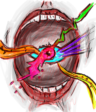
 My first Abstract Smudging Tag My first Abstract Smudging Tag

Don't be too harsh on CnC  . Hope you guide me how to improve in the tag. . Hope you guide me how to improve in the tag.
-

You can't really call this an abstract when your displaying two focal points and one of them being a render. When you think of an abstract painting do you think of the mona lisa or a variation of colors? Despite the render just chilling there to the right of a whole bunch of emptiness the image is too big, It's ok to start an image on a larger canvas to get more detail out of it but remember to scale it down to a more conventional signature dimension. Don't feel obligated to place text onto an image to make it feel finished or complete a lot of times text isn't really needed and is a really hard thing to place and make it look good. And if your going to smudge bright colors like purple and orange try for a darker bg color so the smudge really pops instead of meshing in with the background. The border is too thick, a 1px border is usually enough to set the sights. I think your getting the concept of what your trying to do, all you need to do now is practice, keep it up and you'll get better at it
-
Thanks for the CnC. I will keep it in my mind and again thanks for clearing a basic concept about abstract 
-
Needs a bit more if Im honest, and as JDragon said above, there are two focal points which make it a little awkward.
The smudging doesn't really blend the render in well, this is probably because its quite a large canvas to work with, you know, this could probably work well as just a basic piece, ie, take out the text and the render, swap that black stroke for a white one and bam!

One of the sexiest tags I've ever seen, from Radillac ↓ <3
-
Are you talking about this ??

-
Yeah basically, I think it works a bit better as more of a background and the smudging itself isn't actually that bad.
One of the sexiest tags I've ever seen, from Radillac ↓ <3
-
Thanks for the opinion and yeah i would keep it in my mind.
-
try adding in some more effects with your smudging but stay in flow so u can call it an abstract right now it looks unfinished if u need help u can pm me or cs4pro :P he is pretty wicked with abstract like tags with a focal :P
-
 Originally Posted by sirenzo

try adding in some more effects with your smudging but stay in flow so u can call it an abstract right now it looks unfinished if u need help u can pm me or cs4pro :P he is pretty wicked with abstract like tags with a focal :P
Can you give me best tutorial on this tag so that i can improve myself
-
Start by using a smaller canvas, something like 350x150 or 400x200, then just work around the render.
Tbh the only key secret to making a sig that I can think of is to just pile on a load of stuff in whatever way you choose (smudging, c4ds, fractals, etc..) then spend the rest finishing it (colours, blur/sharpen). (I should probably add a disclaimer here xD Not all sigs need loads of effects obviously, simple ones are great)
For someone starting out I think the smudging in that is pretty darn good. Good luck to you man.
Last edited by Distello; 01-27-2012 at 09:05 AM.
One of the sexiest tags I've ever seen, from Radillac ↓ <3
Similar Threads
-
By Theelectrogypsy in forum Sigs & Manips
Replies: 31
Last Post: 11-11-2011, 08:22 AM
-
By At3rAngelus in forum Digital Art
Replies: 3
Last Post: 01-01-2011, 03:56 PM
-
By Sirlock in forum Support
Replies: 6
Last Post: 06-02-2010, 12:43 AM
-
By +s9.Oath in forum Sigs & Manips
Replies: 15
Last Post: 01-15-2010, 03:22 AM
-
By pro_sxe in forum Sigs & Manips
Replies: 2
Last Post: 08-22-2007, 03:47 PM
 Posting Permissions
- You may not post new threads
- You may not post replies
- You may not post attachments
- You may not edit your posts
-
Forum Rules
|


 Reply With Quote