GFXVoid Graphic Design Forum

Remove Text Formatting
Loading...

» Online Users: 2,593

0 members and 2,593 guests
No Members online

» Site Navigation

 > FAQ

» Stats

Members: 35,442
Threads: 103,075
Posts: 826,688
Top Poster: cc.RadillacVIII (7,429)
Welcome to our newest member, Lekelindids
Results 1 to 5 of 5

Threaded View

  1. #1

    Default My First two sigs... not too bad

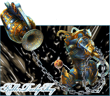
    Yeah I like this background style at the moment lol, plus I'm being rather lazy but I'm workin on a Final Fantasy one that should be good . Just would like some general feedback on the basicness of these.. good or bad


    Last edited by RubberDuckythug; 05-23-2007 at 09:16 PM. Reason: That stupid little white speck above the FF one... will be fixed shortly, ignore it for now

Posting Permissions

  • You may not post new threads
  • You may not post replies
  • You may not post attachments
  • You may not edit your posts
  •  
Powered by vBadvanced CMPS v4.1.1