


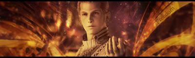
Ok, for anyone who's played Final Fantasy XII. You know, Balthier kicks ass and if you disagree you suck.
Anyway, This is my most elaborate sig to date and you know me. I aim for 1 sig a day sometimes 2. Anyway, I thought my Naruto sig was awesome but this....this blows to out of the water. This took a while but I think it's my best EVER!!! Enjoy.
19 layers + 13 adjustment layers = AWESOMENESS!
v1
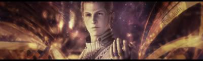
v2
In v2, I added 2 gradient maps to give to more color vs having the real intense reds and oranges. That way its a little more cooler. I did another dodge and burn layer. 1 more blur layer. Honestly, It's a main stock, 1 c4d, and a background stock (see the stars just to the left and right of the focal) Then just clipping masks to give the c4d a little more active effect and brushing to add to the blank spots.
I was trying to do my patented Crescent Freedom text but honestly I couldn't get it the flow correctly with the sig itself and in my eye to would've look very tacked-on. I'll even to a 3rd version if its a necessity. I want to this to be perfect. Figure out why! Mwahahaha!

 Reply With Quote