


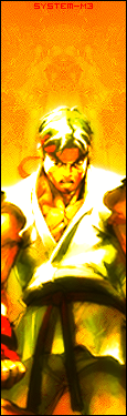
Well ive been using and experimentin wit a few tools in photoshop! I think im comin up wit ma own style =D! Anywayz i made this with default photoshop tools!
I think the top with the sf2 logo looks a bit odd so i think i mite remove it! Here are 2 different versions of the sig! Please tell me which one looks better!
v.1v.2
Hmm..i think the render looks a bit 2 dull..gonna fix that up later
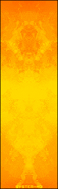
Heres the bg without the renders! Its a new style i made for myself!
R/C and please post which version u think is better!

 Reply With Quote