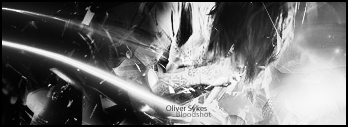
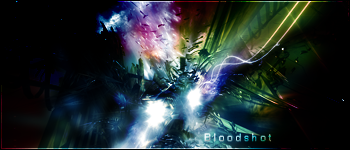
I think I did a little better than the last sig I made.
I tried making it not black and white but the stock photo had like this extremely lime green tint to it, and it was just BLAH
again, done with PS elements 3.0
anyhow.
Oliver sykes sig.
The text feels a lil wrong but thats alright


 Reply With Quote