


Edit: Ok, maybe not recent. Perhaps a brief history.
Mk, first off I'd like to mention that I'm not a 40 step sig maker. Most of what I make is very basic.
Just made this one today early morning. Nothing really special about it, made it for the cuteness.
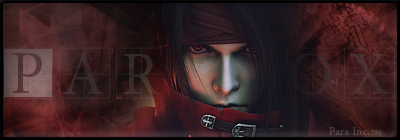
Here's one I made of a Final Fantasy character, added some smoke effects onto the blades that resemble flames to me. Different layer effects on the background C4D. I think that I may have been able to blend the cape into the background because it seems kind of "out there" for me.
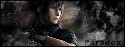
Another Final Fantasy char (you'll find I favor FF) Of course it's red and it's what got me going after a rut of fail sigs. You can't read the text fully but I think that the imagination can invision that it should be behind the render.
Starting to get into some older sigs
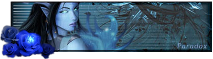
I personally love this, although I have no idea what the character is from. The background is simply something that I found on the web. The small bit of blue coming from the render I cut and smudged into the form that it is. Looking back at the sig now the blue rose seems out of place but it still is just so beautiful.
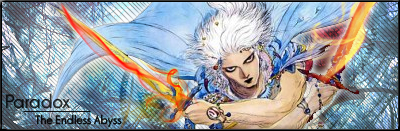
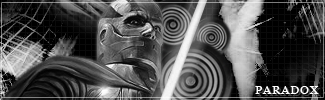
Never played Final Fantasy XIII but I like the look of this guy. Basic grunge brushing for the background which ended up blending quite well with the render. The type is simply awful, made the mistake of widening it to fill the space. The circles I enjoyed, took some pics of an oven stove burner and background filler was created.
Got into Star Wars a bit and made this little sig. Nothing all too amazing but it works. Uses the same stove top burners which like the blue rose from above is probably more out of place than anything.
very old sig from about 3 years ago
First time I was introduced to Grunge and I believe brushes. The type could probably be better but I liked how the dodging on the tongue turned out.
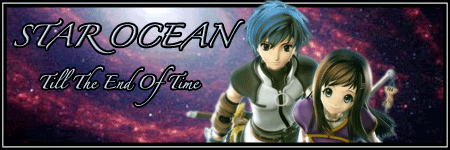
First Sig Ever!!!
It's as simple as it gets. I was taking a graphics arts class and I found myself playing on forums more often than doing my actual work. Had just learned how to cut out backgrounds from a certain assignment and it provided me the knowledge to making a semi decent sig. Background is simply a web pic. Typography and border are hideous sorry. Characters are from Star Ocean Till The End Of Time.
Give me your input. I know over the years I haven't become a master graphics artist, but fancy has never been my style, I prefer basic.


 Reply With Quote