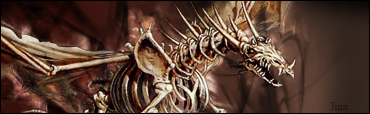
Since my last blunder i've worked hard with my 2nd Favorite Game Character as a render and came up with this. I really like this style, too. A LOT of trial and error. No tutorials.

|
|


Loading...
|
» Online Users: 1,651
|
Results 1 to 7 of 7
Thread: Self Destroyer
Similar Threads
|


 Reply With Quote