0 members and 7,387 guests
No Members online

» Site Navigation

» Stats
Members: 35,442
Threads: 103,075
Posts: 826,688
Top Poster: cc.RadillacVIII (7,429)
|
-

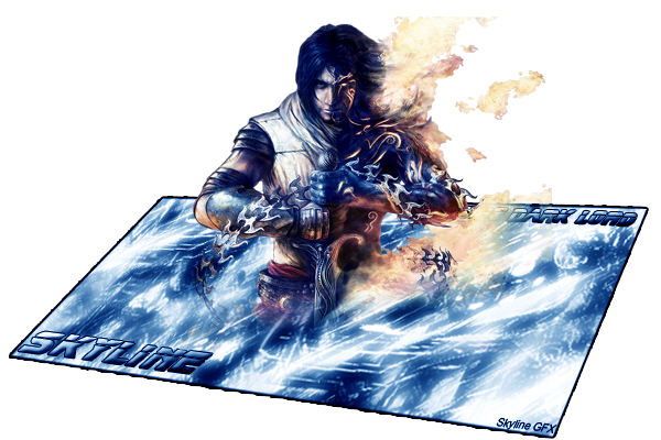
anyone like it?
-
WAY TOO BIG. Render doesn't fit the BG too much, the lines are really bad and pixelated, the text is bad, and the BG looks of a low quality.
-
Originally posted by Shamino@31 Minutes Ago
WAY TOO BIG. Render doesn't fit the BG too much, the lines are really bad and pixelated, the text is bad, and the BG looks of a low quality.
[snapback]161420[/snapback]
While i agree with all those things...i still REALLY like this...its a great effect that i havnt seen for a sig before. as far as size goes you fix that by making the BG @ less of an angle then you can shrink down the prince. great job
-
its really big lol i love the effects and how it looks but the lines are jagged...
-
ahh well, havent been into this stuff that long, so ill continue to try make it better ^^
-
I almost got up and went to the store real quick while this was loading...
The transformed look like that never looks right with sigs, because people always make them too big.
The background doesn't really fit the render. You should have more firey stuff/fire clouds in your background with a splash of something watery.
The render looks like it fades into the background. You should make it look like it cuts right off, like the sig is around his legs.
Keep trying man.
-
-
Originally posted by BreakaKai92@1 Hour Ago
Flames are cut off.
[snapback]161640[/snapback]
Thanks for the info!
-
Originally posted by Heavens-Exile@2 Days Ago
its a great effect that i havnt seen for a sig before
[snapback]161424[/snapback]
It's been done......many, many times before.
-
Originally posted by SgtSwabs@11 Minutes Ago
It's been done......many, many times before.
[snapback]161668[/snapback]
that may be true but thats why i put "I havnt seen" in there. this is my 1st forum so i really havnt seen much
 Posting Permissions
- You may not post new threads
- You may not post replies
- You may not post attachments
- You may not edit your posts
-
Forum Rules
|


 Reply With Quote


