0 members and 688 guests
No Members online

» Site Navigation

» Stats
Members: 35,442
Threads: 103,075
Posts: 826,688
Top Poster: cc.RadillacVIII (7,429)
|
-
-

Well....theres not really much to comment on....Nice use of light I guess...
-
There's more to this tag than you might think.
-
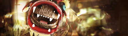
Looks like the bottom of an iceberh lol. I think it's to empty from what I'm seeing  . Also I can barely read you text, and it looks like it says "REA then an upside down R." . Also I can barely read you text, and it looks like it says "REA then an upside down R."
atm for a sig I don't think it does well but if you had some effects maybe.
-
is tag the new word for sig?
anyways, although it looks like you've spent some time on it. it also looks like not a whole lot at the same time. i don't know if you were aiming for minimalism. but i don't think complex minimalism works.
-
<div class='quotetop'>QUOTE(Freak @ Apr 13 2006, 02:42 AM) [snapback]165436[/snapback]</div>

[/b]
I dunno why... But i really like that one.
4-8-15-16-23-42 - SOTW #78
-
<div class='quotetop'>QUOTE(Kaleidoscope @ Apr 15 2006, 03:35 AM) [snapback]165740[/snapback]</div>
is tag the new word for sig?
[/b]
Yes, some people have started calling them tags, though i thought 'tag' was a graffiti term. Anyway the sig is very...abstract. I'd try maybe a little stronger light source. And your text is very hard to read it just looks like 'reak'
This is me.

-
As Kaleidoscope said, you don't tend to use detail in minimalism. This just looks unfinished or something, also. WTF Is it. It doesn't really look like an abstract peice, but there's no sign as to what the image / brushing is.
[/confused]
-
No brushing...just defaults and c4d.
 Posting Permissions
- You may not post new threads
- You may not post replies
- You may not post attachments
- You may not edit your posts
-
Forum Rules
|


 Reply With Quote