0 members and 26,195 guests
No Members online

» Site Navigation

» Stats
Members: 35,442
Threads: 103,075
Posts: 826,688
Top Poster: cc.RadillacVIII (7,429)
|
-


Its a heavy work in progress, but this'll be the basic style that ill continue with the rest of it. gunna put all my art and maps on here when its finished. any comments, critique or ideas?
-
Would like it 5x more if the whole color scheme was like the header. Dont like that brown.
This is me.

-

yeah, i liked it alot more. need more cnc/ideas.
-
Id like it alot more if everything wasnt style/trend whored, i mean the dot things look nice, but the whole layout is in the typical style, as if there are rules where things can be placed; mix it up, be original 
But otherwise, the colors are rocking and it looks like a clean design
-
Smaller, make everything smaller. It'll look alot better. You can work with 10pt font and it'll still be easily legible, so try not to stray too far from that size.
Resident father figure.
-
yeah the grey looks way better then the brown.
everything does seem too big But I do like the header and the buttons
-
-
Few things:
>>SMaller like 43 said
>>Its all 'edgey' if you get me, it should be done with a curve of the pen tool
>>take the dots off the content box
Apart from those its looking hot
-
<div class='quotetop'>QUOTE(rob @ Apr 21 2006, 05:58 AM) [snapback]166321[/snapback]</div>
Id like it alot more if everything wasnt style/trend whored, i mean the dot things look nice, but the whole layout is in the typical style, as if there are rules where things can be placed; mix it up, be original
But otherwise, the colors are rocking and it looks like a clean design
[/b]
oh you know how i love trendwhoring.
im going to start from scratch however and make it smaller, more interesting.
-
Can't wait to see the update, liken it so far =)
-

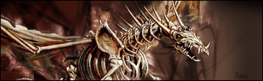
Fresh approach. Going to add shadows/highlights later. this is just a rough shape/colour scheem. CnC PLEASE.
 Posting Permissions
- You may not post new threads
- You may not post replies
- You may not post attachments
- You may not edit your posts
-
Forum Rules
|


 Reply With Quote


