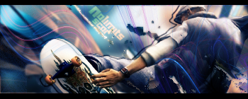
I don't really like the first one. I'd use two different distinct colors instead of two very similar colors.
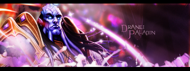
The second one is really good. I like the multicoloring.
The third one is the best one you got there in my opinion, except the Imagination text is really bright at the beginning.


 Reply With Quote