GFXVoid Graphic Design Forum

Remove Text Formatting
Loading...

» Online Users: 14,857

0 members and 14,857 guests
No Members online

» Site Navigation

 > FAQ

» Stats

Members: 35,442
Threads: 103,075
Posts: 826,688
Top Poster: cc.RadillacVIII (7,429)
Welcome to our newest member, Lekelindids
Page 19 of 496 FirstFirst ... 917181920212969119 ... LastLast
Results 181 to 190 of 4959
  1. #181
    Join Date
    Jun 2006
    Posts
    304

    Default

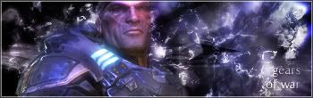
    hate scan bars now lol... the opacity needs lowered on them
    the background is cool
    6.5/10
    newest:

    Like my stuff? wear my tag:
    Code:
    http://xs205.xs.to/xs205/06331/magicfan.png
    Battles Won: 1
    Battles Lost: 1

  2. #182
    Join Date
    May 2006
    Location
    Detroit
    Posts
    403

    Default

    i love it but the text part....?
    9/10


    Pay a visit?

  3. #183
    Join Date
    Aug 2006
    Location
    California
    Posts
    218

    Default

    It's an awesome sig. I love the text glow and the eye is cool looking. I like how blue the eye is. Everything is perfect about it.

  4. #184
    Join Date
    Jun 2006
    Posts
    304

    Default

    i love the text of ur signature its like invisible haha
    i'll rate etitans i guess
    9/10 i love it just the only thing i dont like is how over the edge is maybe move it closer together or something like that
    newest:

    Like my stuff? wear my tag:
    Code:
    http://xs205.xs.to/xs205/06331/magicfan.png
    Battles Won: 1
    Battles Lost: 1

  5. #185
    Join Date
    Aug 2006
    Location
    Ohio
    Posts
    74

    Default

    i really like this one i has agreat abstract style to it just not the whole text area but a 9/10


  6. #186

    Default

    1st: I like it, the character fits the background and it just plain looks cool: 8/10

    2nd: I have no idea what the hell the background is or what its relevance is to the character: 4/10
    I like to think that I'm a gentleman, but I doubt that I actually am because I can be a real ass-hole at times. I try not to b**** much and I always help the unfortunate, but I really actually hate you all deep down in my heart.

  7. #187
    Join Date
    Feb 2005
    Location
    Florida
    Posts
    940

    Default

    6/10
    needs some work
    not a big fan of text


  8. #188

    Default

    Not much work was done creating this. I can tell. 2/10
    I like to think that I'm a gentleman, but I doubt that I actually am because I can be a real ass-hole at times. I try not to b**** much and I always help the unfortunate, but I really actually hate you all deep down in my heart.

  9. #189
    Join Date
    Jun 2006
    Posts
    131

    Default

    hmm the skull don't fit very well with the bg and the text is kinda hard to read but the bg looks good idk 4/10
    my battle winning animation

  10. #190
    Join Date
    Feb 2005
    Location
    Florida
    Posts
    940

    Default

    my sig was more of a easy thing that looks good on the default layout simple but i like the way it looks =p
    Last edited by RoughDraft; 08-09-2006 at 08:29 PM.


Similar Threads

  1. Rate The Sig Above!
    By SgtSwabs in forum The Void
    Replies: 16
    Last Post: 12-06-2005, 08:42 PM
  2. *NEW* Rate Avatar? Rate Sig?
    By LunarPoet in forum Sigs & Manips
    Replies: 1
    Last Post: 06-23-2005, 12:31 PM
  3. Rate my Signature...
    By Xavier in forum Sigs & Manips
    Replies: 8
    Last Post: 06-03-2005, 01:46 AM

Posting Permissions

  • You may not post new threads
  • You may not post replies
  • You may not post attachments
  • You may not edit your posts
  •  
Powered by vBadvanced CMPS v4.1.1