0 members and 720 guests
No Members online

» Site Navigation

» Stats
Members: 35,442
Threads: 103,075
Posts: 826,688
Top Poster: cc.RadillacVIII (7,429)
|
-
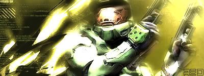
 2 new siggggggs!!!!!!!!!!!!!!!!! 2 new siggggggs!!!!!!!!!!!!!!!!!
CnC pls


(this one is a fixed up version of one i posted earlier)
-
Because the form is still recovering from the downtime at the moment  Not many active users at the moment. Not many active users at the moment.
I like the 2nd one, it looks like a banner or something behind him, simple but it works  The first one ... the render doesn't fit with the background.. use inversed colours or something for that, should look good The first one ... the render doesn't fit with the background.. use inversed colours or something for that, should look good 
The third is dominated with the text, the only text that should be there is matandote... and that is still a little too distracting. I'm not into the 4th one, it's fairly well made i just don't like the style. But that's me
Edit: haha sorry i didn't realise 2 were your signature... oh well, there's some extra critique for you...
-
1st:
-render needs blended
- background needs more color
-background needs more depth
2nd:
i like it but the render needs blended alittle more on the irght
newest:
Like my stuff? wear my tag:
Code:
http://xs205.xs.to/xs205/06331/magicfan.png
Battles Won: 1 Battles Lost: 1
-
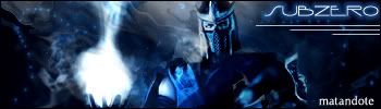
I like the suubzero one the best! but there all pretty cool
keep it up
-
lol wtf....that's the same render I used....noooooooooooooooooo
Haha. Well, Dale gave most of the critic away. I'll just say that I like the second more than the first mainly because of the feel it has.
-
i think they look cool !
look at mine it shows how much i no lol
-
i dont like the second one at all, it lacks depth, i hate that render, and the colours arent very nice. the first one is better, though the render needs a bit of blendage :P try to lower the opacity on the text a bit too. unless there is pure white in the render then try to avoid making your text pure white. for that one i would say like, a crimson or maybe a grey. try to mix up the placement of your renders too, the way you have it now centred like that, its not that interesting, especially without blending. just make it slightly off centre, not completely to the side though. just a suggestion though. keep working at it
-
i really dig the Yoshimitsu sig (love him! Tekken 5 eh? niiice), but the WarCraft sig is just too blurred for my tastes. Yoshimitsu's could use different colors too i think, orange instead of brown for example, but i really like it overall.
-
10/10
i like them both
good job
 Posting Permissions
- You may not post new threads
- You may not post replies
- You may not post attachments
- You may not edit your posts
-
Forum Rules
|


 Reply With Quote