0 members and 2,508 guests
No Members online

» Site Navigation

» Stats
Members: 35,442
Threads: 103,075
Posts: 826,688
Top Poster: cc.RadillacVIII (7,429)
|
-

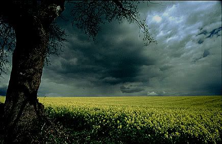
After doing some experimentation for new ideas, I discovered how to give an image the appearance of having an unexpected ghost appear.
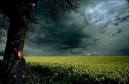
Step 1: Open two images...one of a person that will be the ghost and the scene where the "ghost appeared."
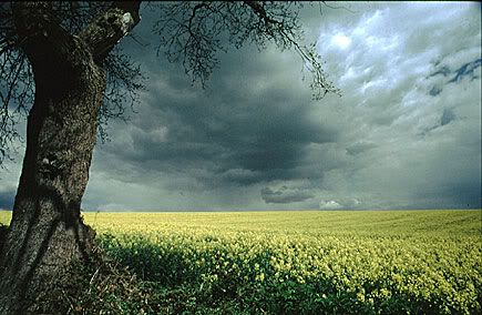
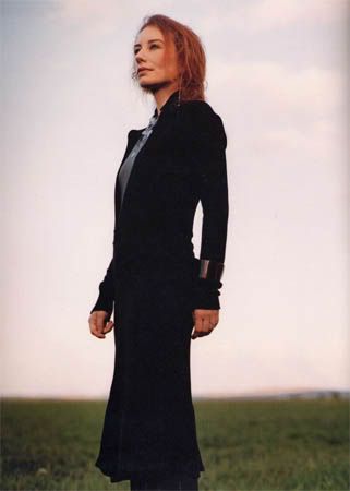
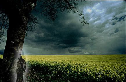
These are the two images I will be using:
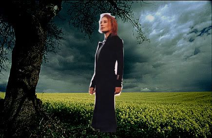
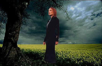
Step 2: First we will do a quick adjustment on our background image. Go to Image>Adjustment>Brightness/Contrast. Add darkness to your image but at a decent amount. I changed mine to -50.
Step 3: Minimize this image and open the subject image. Select the polygonal tool in your tools palette and use that around to select your subject (selection image below). Try to get as accurate as possible. Once you have the subject selected, press Ctrl+C or go to Edit>Copy.
Step 4: Reopen your background image. Press Ctrl+V or go to Edit>Paste and your subject will appear. Go Ctrl+T or Edit>Transform>Scale and, holding down shift so to keep the subject in correct scale and proportion, resize your image to a smaller size.
Step 5: Before anything else, we need to clean-up any extra that shouldn't be with the subject. Clean the image using lasso tool and delete, eraser tool, or any other way that you find easiest to clean the subject.
Step 6: Once again, press Ctrl+T or Edit>Transform>Scale, holding shift, and resize the subject to the size you wish them to appear in your image. Then move the subject to where you want him/her to appear in the picture.
Step 7: Double-click on the subject layer, and the blending options box will appear. Go to "outer glow" and change the blend mode from "screen" to "luminosity." Play with the settings of the spread and size until happy. Make sure it is visible but too intense, because it will look too fake and will detract from the image. Adjust the opacity if it seems necessary. I used 5 for spread and 25 for size. I lowered the opacity to 50%.

Step 8: In the layers palette, change the blend mode of the subject layer from "normal" to "screen." Then go to Filter>Blur>Gaussian Blur and and blur the subject by .5px.
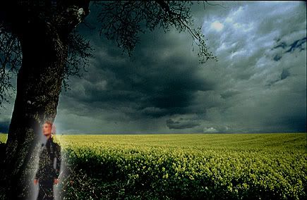
Step 10: Go to Image>Adjustments>Desaturate or press Ctrl+Shift+U. This will make the subject black and white.
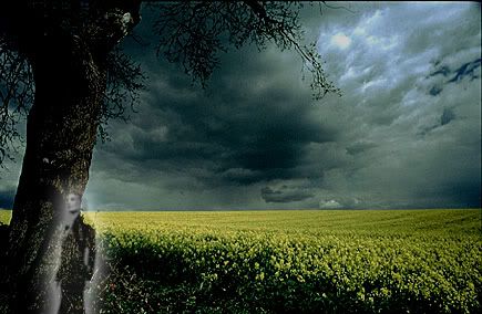
If the subject still seems to opaque or strong, just lower the opacity. You can also move the subject if you feel you'd rather have him/her somewhere else in the image. I found mine to be too intense so I lowered the opacity to 75% and moved her to a different spot by the tree.
Thanks for trying my tutorial!
Image credits:
Tori Amos - www.yessaid.com
Field - www.ans.com.au
-
kool i like it, thanks for the tut
-
<div class='quotetop'>QUOTE(R-e-d @ Jun 28 2006, 08:02 PM) [snapback]176738[/snapback]</div>
kool i like it, thanks for the tut
[/b]
You're welcome. I'm glad you like it and I appreciate the positive feedback. 
-
that's awesome ^^ and it kinda scared me..but whatever great tut and thanks
When all else fails...dance.
-
-
thank a lot Your tut so cool
-
-
good find! thats really kool
-
Thats a pretty cool effect. Thanks.
-
thanks.. pretty good outcome

v2:
some grain and white border

first is better imo
Last edited by Hardcore; 12-15-2008 at 11:06 AM.
Similar Threads
-
By MartinBabies in forum Other Tutorials
Replies: 35
Last Post: 09-13-2008, 04:10 PM
-
By Krimsyn in forum Digital Art
Replies: 10
Last Post: 11-20-2005, 11:42 PM
-
By Lokiwho in forum Digital Art
Replies: 3
Last Post: 11-13-2005, 12:02 PM
-
By ilovecoheed in forum Digital Art
Replies: 11
Last Post: 07-25-2005, 01:57 PM
-
By CrystalDragon in forum Sigs & Manips
Replies: 5
Last Post: 03-13-2005, 08:06 AM
 Posting Permissions
- You may not post new threads
- You may not post replies
- You may not post attachments
- You may not edit your posts
-
Forum Rules
|


 Reply With Quote