0 members and 26,370 guests
No Members online

» Site Navigation

» Stats
Members: 35,442
Threads: 103,075
Posts: 826,688
Top Poster: cc.RadillacVIII (7,429)
|
-
-

fuck yeah man! those are awesome!  you've learned well! you've learned well!
a little C&C...
_______________________________________________
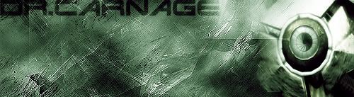
the sig in this post is good as far as background and text goes. It's a little bland without any color but it's okay. The render (assuming you know that the render is the image you put in your sig...) is a little obscure. I think it's a mechanical eye but i'm not sure. it looks like it's not blended very well, i think because it's round and your background is angular. maybe it's just me though.
_______________________________________________
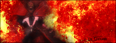
the sig in your actual signature is awesome. that is such a sweet render (bowser ftw...). the only think i can really see wrong with it is the text. the text needs to go. try something like you have in your first sig. if you're looking for more fonts, try www.dafont.com or try www.1001freefonts.com (each one has literally 1k fonts or more... ) other than that, it's awesome...
_______________________________________________
Also, both sigs lack a border, but that is easily fixed. Simply create a new layer on top of all your other layers, use your Rectangular Marquee tool and Select All (Ctrl+A) and simply Right Click > Stroke Selection. Generally users here at the Void stick with a 1px-2px black border (check out my avatar... ;D) just because it's easy and looks good. And for the record, I'm sorry if my directions make you feel like a fucking two year old who doesn't know how to do shit...I'm just attempting to be helpful. I know when I get help, people tell me to do shit and I have no idea how to do it. Let me know if you know how to do all this stuff and want me to shut the fuck up... ;D I won't be offended...
Overall, great fucking job man. They're both awesome...Keep em coming!
:EDIT:
Oh and thanks for giving me credit! I appreciate it...
Last edited by Galazilron; 08-26-2006 at 05:04 PM.
-
I loved the effects man they are trualy 1337, If you have played the Half-life 2 the eye is indeed robotic, its "DOG". but yeah it does clash with the abstract.
Dont worry about babieing me at all, j00 1337 ganksters own by base. . .
For now. 0.o
Boarder duly noted
Your help is greatly apprectiated
"Thats right and God wills it!"
-
Have I ever played Half-Life 2...

Yeah I have, but I never really got that far in it...actually, I didn't pass the "Underground Railroad" part...
Anytime you need the help, just holla atta playa. ;D
Be Easy.
-
i like them both, but i would suggest going past the brushes, start to break out and experiment. great first sigs tho  kudos! kudos!
about the text, i like the first one actually (i think i have that font), the second text is plain, doesnt fit with the sig as a whole.
 Posting Permissions
- You may not post new threads
- You may not post replies
- You may not post attachments
- You may not edit your posts
-
Forum Rules
|


 Reply With Quote


