0 members and 7,159 guests
No Members online

» Site Navigation

» Stats
Members: 35,442
Threads: 103,075
Posts: 826,688
Top Poster: cc.RadillacVIII (7,429)
|
-
08-27-2006, 03:17 PM
#261

as i said before, some more "strength" in the colours, lines, and layout would be good.
But - Use one of your animals as a sig! It would ROCK! 
-
08-27-2006, 03:25 PM
#262
I fucking love that sig dale
Soo much.
How did you do it? Its amazing.
Fucking greaat..
I love it.
-
08-27-2006, 03:50 PM
#263
Henry, the top one needs some text for it and the bottom one is just retarded :P
Top render is nice tho 7/10
Latest:
Persian Warrior
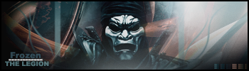
Favorite:
The Legion
 GFXVoid
!
-
08-27-2006, 04:55 PM
#264
it's okay, i like the effect. but the right side looks really obscure. it doesn't match the flow of the rest of the sig. it'd be cooler with a sweet render in there. text is too plain. simple, but too simple. so so...
8/10
-
08-27-2006, 05:18 PM
#265
1, not a render, 2 theres an h
3, bottom is a link, your retarded i hate you die
i dont like the render placement, but the text is good and i guess the background is good. its pretty basic brah
-
08-27-2006, 06:17 PM
#266
pretty nice. left side looks good but the smudging on the right needs work. Like the lighting. 7/10
This is me.

-
08-27-2006, 07:43 PM
#267
It's too plain with no render... the details r also plain.
6/10
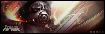
Latest:
Persian Warrior
Favorite:
The Legion
GFXVoid!
-
08-27-2006, 08:31 PM
#268
 Originally Posted by Frozen
It's too plain with no render... the details r also plain.
6/10
how are you going to critique someone on their lack of render when you don't have a render yourself? what the fuck is that?
and do you not appreciate minimalism? do you even know what minimalism is?
anyways, on the count of someone horribly commenting on an amazing sig, i will be critiquiting your sig today Vermilion...
i love your sig. it's so simple, yet so amazing. it's simply ingenious. the best (and only) part about it is the briliant shades/tints of red... swell job, keep it up.
-
08-28-2006, 01:39 AM
#269
2/10
Stock is HUGE and the background is boring and random. There's no lighting and the text was just slapped on.
-
08-28-2006, 06:47 AM
#270
I like it. The line on the T , is a little jagged. Bonus points for the void logo
Similar Threads
-
By SgtSwabs in forum The Void
Replies: 16
Last Post: 12-06-2005, 08:42 PM
-
By LunarPoet in forum Sigs & Manips
Replies: 1
Last Post: 06-23-2005, 12:31 PM
-
By Xavier in forum Sigs & Manips
Replies: 8
Last Post: 06-03-2005, 01:46 AM
 Posting Permissions
- You may not post new threads
- You may not post replies
- You may not post attachments
- You may not edit your posts
-
Forum Rules
|


 Reply With Quote


