0 members and 2,901 guests
No Members online

» Site Navigation

» Stats
Members: 35,442
Threads: 103,075
Posts: 826,688
Top Poster: cc.RadillacVIII (7,429)
|
-
09-03-2006, 07:45 PM
#281

 +drool+....... i dig it, i dig it. 9.25/10 its different, and im partial to animated sigs +drool+....... i dig it, i dig it. 9.25/10 its different, and im partial to animated sigs
-
09-03-2006, 11:53 PM
#282
i like the effect of the bg but its a little small and the text is kinda hard to read 5/10
rate any of mine
my battle winning animation
-
09-04-2006, 03:46 AM
#283
i love the animated 1
looks sweet, and quite original
only negative thing i can think of is that mario seems a bit yellow in colour. maybe u could use some colour correct on him?
-
09-04-2006, 02:42 PM
#284
I like it and i suppose you did it all yourself so i give it an 8/10.
I like a little bit more spaced out sig but it's cool.
8/10
-
09-04-2006, 03:36 PM
#285
It's kinda weird cause the bg doesn't match the render. The background is kinda bright fireworks like. and the render is a wrestler? dunno but i dont think it matches well. The background is nice I'll give you that, but try a different render with it.
6/10
Latest:
Persian Warrior
Favorite:
The Legion
 GFXVoid
!
-
09-04-2006, 05:59 PM
#286
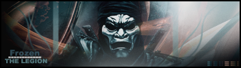
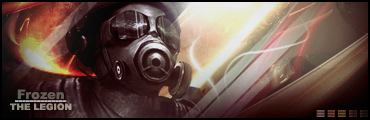
i like frozens its good its flows nice 9/10
-
09-05-2006, 02:44 AM
#287
thats a great stock to work with. i really like what you have done with the edges, but its just not blended into the background. the text is good too. some suggestion i have tho are moving the stock off to the right now, and retooling the background (the boxes stick out, maybe try abstract or grunge). great color scheme tho  its my personal fav (see my sigs its my personal fav (see my sigs  ) )
7.5/10 <-- but great potential
-
09-05-2006, 02:46 AM
#288
wierd phant
5-10
a good look at it and i can see wat u did but not really toooooooooooooooooo dark
..The Dream.
SOTW #73 Winner
-
09-05-2006, 05:17 PM
#289
I have no idea who it is but it looks good. 7/10
-
09-05-2006, 09:14 PM
#290
Its Common! Nice sig 6/10, bring dat bg to life!
Similar Threads
-
By SgtSwabs in forum The Void
Replies: 16
Last Post: 12-06-2005, 08:42 PM
-
By LunarPoet in forum Sigs & Manips
Replies: 1
Last Post: 06-23-2005, 12:31 PM
-
By Xavier in forum Sigs & Manips
Replies: 8
Last Post: 06-03-2005, 01:46 AM
 Posting Permissions
- You may not post new threads
- You may not post replies
- You may not post attachments
- You may not edit your posts
-
Forum Rules
|


 Reply With Quote