0 members and 9,908 guests
No Members online

» Site Navigation

» Stats
Members: 35,442
Threads: 103,075
Posts: 826,688
Top Poster: cc.RadillacVIII (7,429)
|
-
09-05-2006, 09:57 PM
#291

i love ur sig blitz, I think the text, render, bg, everything blends so good. Real fan of the grunge background.
9.99/10 :P
Latest:
Persian Warrior
Favorite:
The Legion
 GFXVoid
!
-
09-05-2006, 10:17 PM
#292
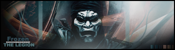
Looks alright, one thing people seem to not get is their sig needs a border.
Your brushings good and your render can do well, but you didn't blend them together. It seems that your render is just on top of your bg.
For future artwork's try to keep the render with at least some of it's original color. Most of the time making the color of your render just one color doesn't turn out well, you need multiple colors normally for a good effect.
Most font should be something that sticks to basic font, unless it goes with the theme. While this font seems like you were trying to go for a military style it doesn't match the rest of your sig. Also it just doesn't go that well by iteslf to me.
Your bg has a lot of empty space in comparison to how detailed you render is or maybe just to ligh. I would suggest either making it smaller and the bg a bit darker or more detail in the bg behind the gun.
As I said looks alright, but a couple of things that are easy to do need to be fixed.
-
09-06-2006, 04:35 AM
#293
i really like it!
it looks really clean (as in no blurry bits). i t almost looks like a broken glass effect, was that what u were aiming for?
any chance of u making a tutorial?
-
09-06-2006, 04:58 AM
#294
atm I don't think I should make a tut, many others have made tutorials on the smudge style and I wouldn't want mine to be close to any other and be considered a ripper.
Now with your sig!!! :P I like the creativity. While this can't be judged upon normal signature standards since it's more of a logo or objec, since it doesn't have a bg or text :P.
So as it is I think it turned out great, wouldn't consider it a sig though 
-
09-06-2006, 11:45 PM
#295
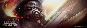
its great that you are straying from your norm. i love how this sig really only contains 2 colors, but isnt "monochromatic". contrast is a tan but high, and the text is hard to read. also i like how the sig is "in action" but its not busy.
9.4/10 (always love your stuff)
-
09-07-2006, 02:48 PM
#296
i like the added part to it looks good about the only thing i don't like is how dark it is and that the text is hard to read other then that its great 9/10
 Originally Posted by mannos

i love the animated 1
looks sweet, and quite original
only negative thing i can think of is that mario seems a bit yellow in colour. maybe u could use some colour correct on him?
ya i gotta fix that it happend when i saved to a gif in the psd the colors are the same as super mario bros 1
my battle winning animation
-
09-07-2006, 04:09 PM
#297
i think the first one looks great , and the third one are genius.
8.5/10
btw , what font are you using in sig nr 2?
-
09-08-2006, 01:27 AM
#298
i don't like it doesn't blend very well and the colors clash 3/10
btw the font is Calligrapher
my battle winning animation
-
09-08-2006, 01:42 AM
#299
1st:
The monitone doesn't work that well, I know the original render isn't that colorfull but the bg just dulls it. The good thing about that effect is it comes out with a stand still frame. So looks like action was paused.
The fad doesn't look that good, it seems like it has a bevel on it. Also the bg to the right is contrasted way to much compared to the left.
The font used is alright, not the best but it can be worked into the sig, the outer glow is what kills it for me in this sig. I would try a different color of text than the outer glow.
2nd:
Vary creative, though as actual work it doesn't seem likemuch. The bg seems like it was saved in .gif format with less then 256 coloring. Like the idea though
3rd:
I remember seeing this before :P. This can't really be judged as a normal artistic piece, just credit for animation. It's creative and down well for animations but has a few scenes where it isn't so smooth in animation. Great idea though.
-
09-09-2006, 02:12 AM
#300
top: iono i don't like this one that much 7/10
bottom one: i LOVE it 9.6/10 (the text could be adjusted)
..The Dream.
SOTW #73 Winner
Similar Threads
-
By SgtSwabs in forum The Void
Replies: 16
Last Post: 12-06-2005, 08:42 PM
-
By LunarPoet in forum Sigs & Manips
Replies: 1
Last Post: 06-23-2005, 12:31 PM
-
By Xavier in forum Sigs & Manips
Replies: 8
Last Post: 06-03-2005, 01:46 AM
 Posting Permissions
- You may not post new threads
- You may not post replies
- You may not post attachments
- You may not edit your posts
-
Forum Rules
|


 Reply With Quote