0 members and 5,324 guests
No Members online

» Site Navigation

» Stats
Members: 35,442
Threads: 103,075
Posts: 826,688
Top Poster: cc.RadillacVIII (7,429)
|
-
09-09-2006, 05:06 PM
#301

I like the way you cut the render and blended it with a diff shade of orange dimming and dimming until black. I assume you took A LOT of time into this sig. I like the border, it gives it a kind of movie effect. Nice overall job tho 9/10
Latest:
Persian Warrior
Favorite:
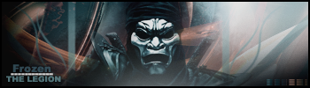
The Legion
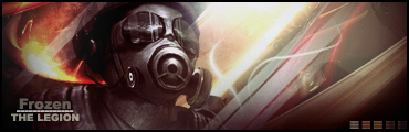 GFXVoid
!
-
09-10-2006, 03:32 AM
#302
yeah like i had a first version but it was like kinna dull
so i spiced it p
and it took a while to get it where i thought it looked and there u have it
but on yurs...umm...i like wat u were tryin to do...but i don't think it worked out...6.5/10
..The Dream.
SOTW #73 Winner
-
09-10-2006, 03:11 PM
#303
i like the effect it gives off kinda like a mc settin the stage on fire :-D nice blending too good work over all 9/10
my battle winning animation
-
09-10-2006, 09:09 PM
#304
Very good animation and somewhat original 9/10
Good song 7/10
Good signature overall but not fond of the text 9/10
-
09-10-2006, 10:01 PM
#305
when i realized what your sig was doing, i really enjoyed it. what i dont like is the background (its what threw me off), and the text. you can probably download the spiderman font (from the movie), and use that, scrap the glow. but i still really like this sig, maybe add one more "frame" to the right.
8.7/10
-
09-12-2006, 09:05 PM
#306
-
09-12-2006, 09:08 PM
#307
Too much contrast, but ok, 6/10.
-
09-12-2006, 11:39 PM
#308
i like the gambit sig the blur of him is sweet and its well blended the first one i don't like no reason just don't like it :-(
gambitsig 8/10
my battle winning animation
-
09-13-2006, 10:06 PM
#309
It's nice but is the whole thing a pic or is he cut out? If so nice cut. Very nice on the text to appear as carved in. Text in bottom left is plain but it is ok because I feel it pulls more attention torward the pic and not the text.
If pic is whole: 6/10
If made: Very Nice! I couldn't tell a diff. 9/10
Latest:
Persian Warrior
Favorite:
The Legion
GFXVoid!
-
09-13-2006, 10:57 PM
#310
its a cut the bench and kurt are 2 diffrent pics i maniped them together the bench is kurt cobains unofficial memorial bench
i like your top sig its well blended and nice effect 7/10
my battle winning animation
Similar Threads
-
By SgtSwabs in forum The Void
Replies: 16
Last Post: 12-06-2005, 08:42 PM
-
By LunarPoet in forum Sigs & Manips
Replies: 1
Last Post: 06-23-2005, 12:31 PM
-
By Xavier in forum Sigs & Manips
Replies: 8
Last Post: 06-03-2005, 01:46 AM
 Posting Permissions
- You may not post new threads
- You may not post replies
- You may not post attachments
- You may not edit your posts
-
Forum Rules
|


 Reply With Quote


