0 members and 531 guests
No Members online

» Site Navigation

» Stats
Members: 35,442
Threads: 103,075
Posts: 826,688
Top Poster: cc.RadillacVIII (7,429)
|
-
 Sig. Sig.
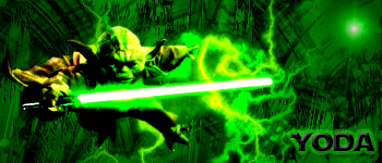
This is my second sig. tell me what you think
-

For a second sig it's not too bad. The main thing I would do is make the render of yoda stand out more. Try not putting the background color over him and blending him in a little more. To blend, just smudge a bit all the way along its edge and then duplicate it and gaussian blur the bottom layer just a bit. Also, a little more variety in color would make it much better. Those are just a few tips, but again, that's pretty darn good for a second sig! Keep working and experimenting!
-
 Which Sig. is better? Which Sig. is better?
Which one of these sigs do you think is better?

-
Second one. The saber looks kinda funny in the top one. Maybe it's just too bright?
You've definitley improved fast. My first few sigs, were, filter,render clouds, slap a render in, add some ugly text and call it a day. Well..sometimes I still do that, heh.
Keep at it.
 Thanks.
Prick.
 Posting Permissions
- You may not post new threads
- You may not post replies
- You may not post attachments
- You may not edit your posts
-
Forum Rules
|


 Reply With Quote