0 members and 674 guests
No Members online

» Site Navigation

» Stats
Members: 35,442
Threads: 103,075
Posts: 826,688
Top Poster: cc.RadillacVIII (7,429)
|
-
11-15-2006, 06:06 AM
#391

Just looks like brushing and maybe you filtered the render a bit...nothing special really 7/10

Ok...
-
11-17-2006, 03:29 PM
#392
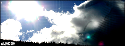
The vague effect on the right is pretty cool. Also, I like the text 
I prefer game renders though.
8/10
PS: If you're gonna rate mine; this is not my best. My best (imo) is this one:

-
11-17-2006, 08:07 PM
#393
yeah, you're right, the one you posted is the best out of those two.
8.5/10 for your best, 7/10 for your sig
i just don't like those colours or the border. still a good sig though.
-
11-17-2006, 08:57 PM
#394
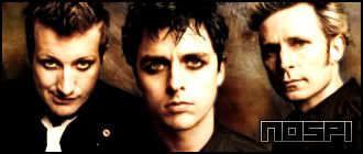
Green Day? Ew. Not my cup-o-tea. the text is okay, but it looks like just a picture of the band...nothing too fantastic. You might have done more, I just can't see it.
-
11-17-2006, 09:24 PM
#395
i like the color combo..?
-
11-18-2006, 09:53 AM
#396
-
11-18-2006, 03:36 PM
#397
-
11-18-2006, 06:31 PM
#398
Nice lion effect It really looks like it's mad and in motion 
Great one ^^
-
11-19-2006, 09:21 AM
#399
-
11-19-2006, 09:42 AM
#400
Wowowowo i really like it, i hope you drew the character though
But. It's pretty fucking individual and it just got a wicked feel. I like the kinda... reminds me of an old french looking style of drawing. Crazy french cartoons  .. or something. .. or something.
niceee
Similar Threads
-
By SgtSwabs in forum The Void
Replies: 16
Last Post: 12-06-2005, 08:42 PM
-
By LunarPoet in forum Sigs & Manips
Replies: 1
Last Post: 06-23-2005, 12:31 PM
-
By Xavier in forum Sigs & Manips
Replies: 8
Last Post: 06-03-2005, 01:46 AM
 Posting Permissions
- You may not post new threads
- You may not post replies
- You may not post attachments
- You may not edit your posts
-
Forum Rules
|


 Reply With Quote