0 members and 7,185 guests
No Members online

» Site Navigation

» Stats
Members: 35,442
Threads: 103,075
Posts: 826,688
Top Poster: cc.RadillacVIII (7,429)
|
-
11-29-2006, 01:18 PM
#431
-
11-29-2006, 09:24 PM
#432

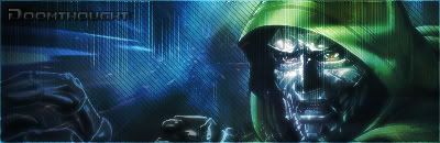
The middle one is my least favorite, but all of them are better than i could do 
I really like the last one... it looks like it could be a sig/blog banner
8/10
7/10
9/10
and like i said, all better than mine
-
11-29-2006, 09:37 PM
#433
under contrasted, text is horrible, too big, to much, un organized
no real back ground, and no focal point with the two people.
try again? :}
-
11-30-2006, 05:14 AM
#434
-
11-30-2006, 10:08 AM
#435
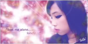
 Originally Posted by lolla_susu

i like the number 2...
Uhhh what...?
Its blurry, text is baad, poorly placed and all
and the quote is placed pretty bad..
lacks depth
background is way to blurry
render is nt blended
the flare filter is way out of place with the sharpness of the lines
-
11-30-2006, 12:25 PM
#436
its pink and has words in it  works for me works for me
-
11-30-2006, 08:47 PM
#437
well I didn't use blender, I make the background using brush black and white and then i use a lot of color balance effect..
and blur is my point ;p
-
12-01-2006, 03:08 PM
#438
-
12-01-2006, 03:32 PM
#439
Newest:
-
12-03-2006, 03:32 PM
#440
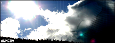
kickass
9/10
Similar Threads
-
By SgtSwabs in forum The Void
Replies: 16
Last Post: 12-06-2005, 08:42 PM
-
By LunarPoet in forum Sigs & Manips
Replies: 1
Last Post: 06-23-2005, 12:31 PM
-
By Xavier in forum Sigs & Manips
Replies: 8
Last Post: 06-03-2005, 01:46 AM
 Posting Permissions
- You may not post new threads
- You may not post replies
- You may not post attachments
- You may not edit your posts
-
Forum Rules
|


 Reply With Quote