0 members and 26,370 guests
No Members online

» Site Navigation

» Stats
Members: 35,442
Threads: 103,075
Posts: 826,688
Top Poster: cc.RadillacVIII (7,429)
|
-
12-29-2006, 06:54 PM
#461
-
12-29-2006, 07:04 PM
#462

Pretty cool, nice and sharp. A bit plain though, I think you should have used more colors. Maybe better without a border too. Text is nice, but might be too visible/distracting. Rating? uh, e/pi.
edit, that was for swabs.
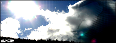
as for PHXN, I'm looking at the top one. Colors are a bit random, as is the bg. The stock is sharp, but it seems a bit equal in emphasis with the bg. Text is kinda weak, but it's so hard to see it doesn't really take away. Could be less random overall. 7/11.
Last edited by Jeff; 12-29-2006 at 07:07 PM.
-
01-03-2007, 08:14 PM
#463
-
01-04-2007, 01:21 AM
#464
all his sigs are good
9/10
-
01-04-2007, 05:54 AM
#465
First.. 6/10 Just a picture or two and text..
Second.. 7/10 This one looks better, though The white text doesnt work that well (diff colour maybe?)
-
01-04-2007, 07:34 AM
#466
the whole animation thing is cool...kinda makes me dissy XD 7/10

Ok...
-
01-05-2007, 06:36 PM
#467
animation between the pics could be smoother
u juss slapped on pics to a bg and added text...so...5/10
..The Dream.
SOTW #73 Winner
-
01-05-2007, 08:13 PM
#468
pretty good., but not that exciting ( for both )
-
01-06-2007, 12:07 AM
#469
oi...was running an experiment manko-poo...
Ok...
-
01-06-2007, 10:28 AM
#470
7/10
Text is hard to read, its been a while since i've done this lol. Other than that pretty good. Has good taste in anime.
Last edited by Daemon_; 01-06-2007 at 10:38 AM.
Similar Threads
-
By SgtSwabs in forum The Void
Replies: 16
Last Post: 12-06-2005, 08:42 PM
-
By LunarPoet in forum Sigs & Manips
Replies: 1
Last Post: 06-23-2005, 12:31 PM
-
By Xavier in forum Sigs & Manips
Replies: 8
Last Post: 06-03-2005, 01:46 AM
 Posting Permissions
- You may not post new threads
- You may not post replies
- You may not post attachments
- You may not edit your posts
-
Forum Rules
|
![[PHXN] New001's Avatar](image.php?u=7015&dateline=1264038258)
![[PHXN] New001 is offline](http://www.gfxvoid.com/forums/images/statusicon/user-offline.png)

![Send a message via AIM to [PHXN] New001](http://www.gfxvoid.com/forums/images/misc/im_aim.gif)
![Send a message via MSN to [PHXN] New001](http://www.gfxvoid.com/forums/images/misc/im_msn.gif)
![Send a message via Yahoo to [PHXN] New001](http://www.gfxvoid.com/forums/images/misc/im_yahoo.gif)


 Reply With Quote