


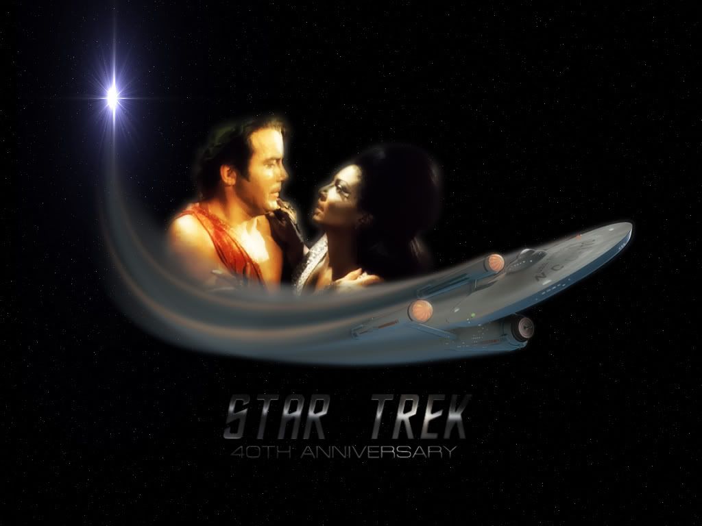
The reason I decided on this particular image of Kirk and Uhura was because this was the first time a white man and a black woman had kissed on Television and at the time it caused a bit of an uproar.
But it also proved that the Enterprise really was Boldly Going where no man had gone before...

 Reply With Quote
![f y a s [k] o's Avatar](image.php?u=7339&dateline=1168833522)
