0 members and 4,999 guests
No Members online

» Site Navigation

» Stats
Members: 35,442
Threads: 103,075
Posts: 826,688
Top Poster: cc.RadillacVIII (7,429)
|
-
-

wow, looks great =)
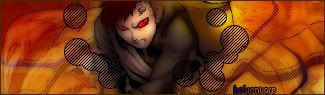
I like the second best  border isn't really great but the rest is good. And uhm, Naruto is a crappy anime border isn't really great but the rest is good. And uhm, Naruto is a crappy anime
-
v.1 looks good  but I don't like the render=/ try do something more with it... like adding some completly different effect on it or something.. you could also make the light better.. gj! but I don't like the render=/ try do something more with it... like adding some completly different effect on it or something.. you could also make the light better.. gj!
-
And uhm, Naruto is a crappy anime
OMFG! BLASPHEMY!lol I ban you.
for the border should I add an effect in the space in between?
@sunshine: I wanted to make the scatter effect like he was breaking apart but I failed, coincidentally resulting in the colors you see before you.lol


Pay a visit?
-
 Originally Posted by Etitan

!lol I ban you.
hahaha, nice signature too
deaz\dxloa\dxedr

-
i like the sig border isnt the best but its ok and Raiko all anime is crappy.
 My DevART
RATCHET is my bitch
Andrew says:
u ever stolen a bible?
Apathy says:
no
used the last two pages to roll a joint though
Andrew says:
wow
thats fucking hard core
^^HAHAHA, dm sucks XD
-
I actually kinda like that border. It's different and really doesn't take away from the sig any.
-
-
yo dude
where did you get the render
it totally looks cool
can you send me the render plz
-
nice dude. wish my stuff was that good.
Similar Threads
-
By Rebearth in forum Sigs & Manips
Replies: 10
Last Post: 01-09-2006, 09:11 AM
-
By -Kanji- in forum Sigs & Manips
Replies: 4
Last Post: 03-30-2005, 08:31 PM
-
By eLLuSioNiST in forum Sigs & Manips
Replies: 16
Last Post: 02-23-2005, 10:12 PM
 Posting Permissions
- You may not post new threads
- You may not post replies
- You may not post attachments
- You may not edit your posts
-
Forum Rules
|


oh yea, I figured out the feather blend.lol


 Reply With Quote


![[PHXN] New001's Avatar](image.php?u=7015&dateline=1264038258)