0 members and 490 guests
No Members online

» Site Navigation

» Stats
Members: 35,442
Threads: 103,075
Posts: 826,688
Top Poster: cc.RadillacVIII (7,429)
|
-
 Rate please? Rate please?
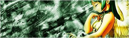
Any suggestions would be awesome l know text is stuffed up but im still learning text l guess and l think maybe my bg colour is a little off l was thinking of a golden colour for the bg but anyways Rate please 
-
-
 Originally Posted by [PHXN] New001

Its a start. The BG is good, but not for the render. Its like the BG is of the chaotic theme which clashes with the render. See what I'm saying? Kindof messes up the flow.
Also becareful when you blend the render, You almost lost her nose :P
Keep workin so theres not soo much empty space, and you'll start producing some great sigs
lol do you suggest l put another render in the empty spaces or could l just shape the image differently to make the sig look more full?
-
-
i agree. maybe cutting down the size would be a good idea if u dont have many other ideas for it. also itd make the sig look a little more full if the Wolf was on the other side and up a little. jus keep workin.
 My DevART
RATCHET is my bitch
Andrew says:
u ever stolen a bible?
Apathy says:
no
used the last two pages to roll a joint though
Andrew says:
wow
thats fucking hard core
^^HAHAHA, dm sucks XD
-
i like it wolf except i don't like the bg colour but other than that GJ
-
ty Kemo l appreciate it =)
Similar Threads
-
By Vinay in forum Sigs & Manips
Replies: 4
Last Post: 10-03-2005, 07:34 PM
-
By markov in forum Sigs & Manips
Replies: 6
Last Post: 08-13-2005, 07:25 PM
-
By LunarPoet in forum Sigs & Manips
Replies: 1
Last Post: 06-23-2005, 12:31 PM
-
By DOPE Purple Haze in forum Sigs & Manips
Replies: 13
Last Post: 06-10-2005, 07:51 PM
-
By DOPE Purple Haze in forum Sigs & Manips
Replies: 1
Last Post: 06-06-2005, 01:39 AM
 Posting Permissions
- You may not post new threads
- You may not post replies
- You may not post attachments
- You may not edit your posts
-
Forum Rules
|


 Reply With Quote
![[PHXN] New001's Avatar](image.php?u=7015&dateline=1264038258)
![Send a message via Yahoo to [PHXN] New001](http://www.gfxvoid.com/forums/images/misc/im_yahoo.gif)


