0 members and 1,157 guests
No Members online

» Site Navigation

» Stats
Members: 35,442
Threads: 103,075
Posts: 826,688
Top Poster: cc.RadillacVIII (7,429)
|
-
02-16-2007, 11:06 AM
#531

 Originally Posted by Dale

Firstly, what's up with rating rofl.
ahahahhaha, I lol'd ;X
85/100 xD
-
02-16-2007, 02:21 PM
#532
-
02-16-2007, 04:06 PM
#533
-
02-16-2007, 04:32 PM
#534
-
02-16-2007, 06:51 PM
#535
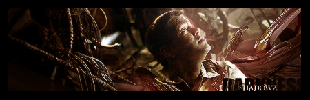
oo, nice and unique. 9/10
-
02-18-2007, 12:50 PM
#536
background is kinda random and it could use some lighting. the focal point is definitely focal though, so good job on that part. 7/11
-
02-18-2007, 12:54 PM
#537
Originally Posted by Dale
Firstly, what's up with rating rofl.
Second... it's a photo...
Third... why capitals on every word?
And.. i think that yours could do with a bordr, possibly some better blending, or more realistic background. The text is too dominant imo aswell
The capitals thing, when you type in all caps, it auto changes to that FORL.
Uhr.. didnt see the previous persons. If its joos's theyre cool 
-
02-18-2007, 01:01 PM
#538
-
02-18-2007, 01:57 PM
#539
-
02-18-2007, 10:54 PM
#540
Similar Threads
-
By SgtSwabs in forum The Void
Replies: 16
Last Post: 12-06-2005, 08:42 PM
-
By LunarPoet in forum Sigs & Manips
Replies: 1
Last Post: 06-23-2005, 12:31 PM
-
By Xavier in forum Sigs & Manips
Replies: 8
Last Post: 06-03-2005, 01:46 AM
 Posting Permissions
- You may not post new threads
- You may not post replies
- You may not post attachments
- You may not edit your posts
-
Forum Rules
|


 Reply With Quote
![[PHXN] New001's Avatar](image.php?u=7015&dateline=1264038258)
![Send a message via AIM to [PHXN] New001](http://www.gfxvoid.com/forums/images/misc/im_aim.gif)
![Send a message via MSN to [PHXN] New001](http://www.gfxvoid.com/forums/images/misc/im_msn.gif)
![Send a message via Yahoo to [PHXN] New001](http://www.gfxvoid.com/forums/images/misc/im_yahoo.gif)