0 members and 606 guests
No Members online

» Site Navigation
» Stats
Members: 35,442
Threads: 103,075
Posts: 826,688
Top Poster: cc.RadillacVIII (7,429)
|
-
Made For A Friend
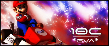
I have a friend in North Dakota who races go-karts semi-pro and he asked me to work him up a sig. Let me know what ya think. I wanted to be original simple and yet make it kewl. Wich version do you like better
1

2
Last edited by Riddleb0x; 02-18-2007 at 05:10 PM.
-
I love the bg and the colors go great with teh renders. the font is a lil big but goes great with the sig. not a fan of the border tho. but overall great job.
My DevART
RATCHET is my bitch
Andrew says:
u ever stolen a bible?
Apathy says:
no
used the last two pages to roll a joint though
Andrew says:
wow
thats fucking hard core
^^HAHAHA, dm sucks XD
-
thanx man but wich one do you like best?
p.s. i want that render of Maynard
-
I like the top one, the bottom is a bit dark for me. But I have to say they both is not great, the text just does not go well with the stock nor the background, and the renders are pretty horrible.
~I fly even when i get high~
-
lol are you drunk redx l think the first 1 looks great,vibrant colours nice render and text is ok but make it a little smaller.Nice work man
-
1. The background is too saturated though, and the lighting is off.
-
#1 is better, you can see Mario better. Nice bg.
------------
C4D Render by Sobe, Planetrenders.com
------------
Similar Threads
-
By sirenzo in forum Sigs & Manips
Replies: 5
Last Post: 12-21-2006, 12:06 AM
-
By keden in forum Sigs & Manips
Replies: 7
Last Post: 01-27-2006, 09:25 AM
-
By ´§ëVë®å£` in forum Sigs & Manips
Replies: 5
Last Post: 04-30-2005, 01:26 PM
-
By Haven in forum Sigs & Manips
Replies: 4
Last Post: 03-09-2005, 11:26 AM
-
By ´§ëVë®å£` in forum Sigs & Manips
Replies: 2
Last Post: 03-01-2005, 01:34 PM
Posting Permissions
- You may not post new threads
- You may not post replies
- You may not post attachments
- You may not edit your posts
-
Forum Rules
|