0 members and 688 guests
No Members online

» Site Navigation

» Stats
Members: 35,442
Threads: 103,075
Posts: 826,688
Top Poster: cc.RadillacVIII (7,429)
|
-
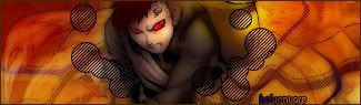
 first sigs first sigs
I only started makin sigs recently so these are totally basic and nowhere near the standards I've seen on here.
the car one was a request and not my kinda thing at all but it was fun learning to animate them.
I really like the sigs where the render gets all mottled at the edges and blends in that way, think it's grunge style (not sure) but I just can't do it at all, when it comes to smudging brushes and stuff I just end up with a big blob under my image 
anyways..here's what I can do..


Last edited by VodkaSlayer; 02-21-2007 at 08:41 PM.
-
that 2nd one is straight up deadly. the landscape looks cool with the render and the border
-
the second one is nice but look at the render its chopped you need to fix that and the borders are way to big. Lemmie eleborate. I love that second ones potential A LOT its kewl original and can be made awesome just needs a few simple fixes. I am not big on animation in sigs however thats a personal thing and i know it aint easy. I donno how much PS experience you have but if you have enuff and sigs are just real new to you, From just your ideas I can see very awesome work from you in the near future with a little fine tunning. 
Last edited by Riddleb0x; 02-22-2007 at 01:19 AM.
Reason: because i didnt want to come off as an a@@hole
-
what did you use to get the "rollup" on the 4th one?
-
ya that second 1 is tight i loike alot
PS listen to riddle the guy is brilliant
-
Second one, your background is very well done. I would mess with the tree branches to the right with blending modes and opacity a bit and see what you come up with. Try a different render with it though. The boarder is a bit big, but it somewhat fits, if it were all the same colour.
I'd like to see what you can do with that.
The third one, I think that your border works relatively well , your bg needs some work, the render seems to have rough edges, and it needs some very simple text. With a boarder like that I would try out some text placed on it. It might look cool.
Good work man.
 Thanks.
Prick.
-
-
Your second one's the best - by far. Apart from that, I also like the 3rd one... But yeah, the second one's awesome.
-konfusion
-
 Originally Posted by VodkaSlayer

I only started makin sigs recently so these are totally basic and nowhere near the standards I've seen on here.
the car one was a request and not my kinda thing at all but it was fun learning to animate them.
I really like the sigs where the render gets all mottled at the edges and blends in that way, think it's grunge style (not sure) but I just can't do it at all, when it comes to smudging brushes and stuff I just end up with a big blob under my image
anyways..here's what I can do..
You need sigs for them..and make sure they're not moving pictures. And please use a better font that will match with those pictures and backround colors of those banners/avatars. Use different pictures of anime...their stance and positions were drawn very stiff. And when you make your banners and things like that, it's very important not to just add effects to it...it'll make it looks dull. But then again, if you're not going to put in any effects into it(which is fine), make a border...actually, I prefer a border ALWAYS. Without it, it looks...lost, boring, empty, and it just looks naked...I don't know how else to put it. [border thing is just a tip].
Other than that, great job on your first work.
^-^
-
Pretty impressive if your pretty new to PS.
 Posting Permissions
- You may not post new threads
- You may not post replies
- You may not post attachments
- You may not edit your posts
-
Forum Rules
|


 Reply With Quote
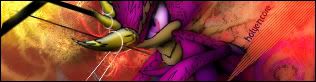


![[PHXN] New001's Avatar](image.php?u=7015&dateline=1264038258)
![Send a message via AIM to [PHXN] New001](http://www.gfxvoid.com/forums/images/misc/im_aim.gif)
![Send a message via Yahoo to [PHXN] New001](http://www.gfxvoid.com/forums/images/misc/im_yahoo.gif)


