0 members and 897 guests
No Members online

» Site Navigation

» Stats
Members: 35,442
Threads: 103,075
Posts: 826,688
Top Poster: cc.RadillacVIII (7,429)
|
-
 rate them? rate them?
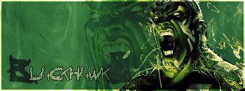
#1
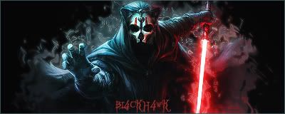
#2
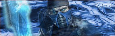
#3

please and thank you 
-
My favorite is #3, and after looking at #2 I though to myself KOTOR 1 was way better than KOTOR 2 lol. They are all good, just work on the text.
XBOX Live Gamertag: Merc 106

-
First ones...ok...
Second one is awesome
Third one needs work - the blending on that is quite bad, and the render doesn't seem to fit in...
Work on the text (I'm a text nazi >.<)
-konfusion
-
i really like #2 but yeah...the text needs to be a little more sinister to fit. 1 and 3 dont do anything for me. they look too "normal" like theyve been done before. the (im gonna guess) liquifying you did on 2 is top notch.
-
liquifying and rippleing
and i suck with text, i can never find text that fits so i end up jus giving it stroke an setting it to softlight, some1 should show me some good sig text tricks =p
Last edited by BL4CKH4WK; 03-05-2007 at 05:21 PM.
-
eventhough i havent really gotten the whole text thing down yet, what i keep hearing is "keep it simple". i downloaded something like 250 fonts ranging from ac/dc fonts to zimbabwe script and everything inbetween. all this did is make the choice of font the hardest and most time consuming part of the sig/artwork. keeping it simple helps. also, instead of choosing "which" font, try thinking about what you want to do with the font. maybe multiple colors, maybe intermixing words, wordplay, working it into the art, etc. look at this link and you'll see what im talking about.
http://www.gfxvoid.com/forums/showthread.php?t=6450
the sig isnt great but what he did with the font was very basic but very impactful, imo of course.
-
Your third one's well done. When it comes to text, I say it over and over. Keep it simple. Check the text tutorial forum for a basic rundown on text I wrote. It's the hardest part of making anything in my opinion, and I have to agree with The Wrench when he says having hundreds of fonts installed just makes it harder to pick one.
Sure, install a few that you like, but don't go overboard.
 Thanks.
Prick.
-
The second one is tight..But the text sucks on all of them.
-
thnx for the text tips wrench 
-
2nd one looks awesome, and i agree with Shadow Warrior KOTOR 1 was way better than the 2nd. nice effect on the second and just try working on your text. the others aren't that bad though.
Fav:

 Originally Posted by kemo

Kemo_is_god: shutup sic.sick
sic.sick6: oh noes... i must shuttup! kemo's mighty servant hath spoken...
Similar Threads
-
By Wolf in forum Sigs & Manips
Replies: 6
Last Post: 02-06-2007, 10:46 PM
-
By keden in forum Sigs & Manips
Replies: 16
Last Post: 08-29-2005, 05:07 PM
-
By ANtidote in forum Sigs & Manips
Replies: 12
Last Post: 08-19-2005, 03:50 PM
-
By LunarPoet in forum Sigs & Manips
Replies: 1
Last Post: 06-23-2005, 12:31 PM
 Posting Permissions
- You may not post new threads
- You may not post replies
- You may not post attachments
- You may not edit your posts
-
Forum Rules
|


 Reply With Quote


 |
| |
| |
| |
| |
| |
|") |
|
