0 members and 615 guests
No Members online

» Site Navigation

» Stats
Members: 35,442
Threads: 103,075
Posts: 826,688
Top Poster: cc.RadillacVIII (7,429)
|
-
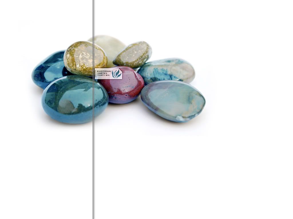
 Emotional Vortex Thirty-Six Emotional Vortex Thirty-Six
Y'all like it. The red stone is real, the rest are renders XD
Took, like, a week to make this...
Last edited by LokenII; 03-21-2007 at 08:07 AM.
Reason: Midget tampering...
-
All the techy stuff ruins it imo. It's a very nice render man 
Some pitts or scratches/craters might help make the others look more realistic. although it's hard to tell anyway
Real nice job
-
 Originally Posted by Dale

All the techy stuff ruins it imo
exactly, get rid of it and it'll be awesome
-
looks amazing.... maybe a tad more shadow under the rendered stones?
-
i love it. maybe to high opacity of scanlines.
current:

fav:

-
You should delete all the scanlines and stuff, so only the render will remain. Make the canvas some bigger and move the stones to the left bottom, and you will have a wonderfull wallpaper! I really love the shiny look of the renders
-
wanted the scanlines to make it look a bit holography. It needed to look a bit Sci-Fi without being, well, cheesy sci-fi basically, so that is the reason for all the tech stuff.
-
a nice idea, ( since i know what it is you're doing with sic.sick6 ) perhaps getting rid of the scanlines right, and then on one of the pebbles have part of it cut out and raise it up and have like a periscope looking thing popping out with the stone part on top of it xD like a little pebble looking alien space craft, it is sci-fi after all : D
deaz\dxloa\dxedr

-
Its rocks, they dont need to be Sci fi haha
Get rid of everything but the actual renders and picture :/
-

here's the original... sorry loken if u didnt want to post this... but it looks much better this way...
Similar Threads
-
By mrwho in forum The Void
Replies: 9
Last Post: 10-29-2006, 10:54 AM
-
By Unforgotten in forum Digital Art
Replies: 10
Last Post: 05-20-2005, 01:44 PM
-
By Mage in forum Sigs & Manips
Replies: 12
Last Post: 02-25-2005, 04:23 PM
 Posting Permissions
- You may not post new threads
- You may not post replies
- You may not post attachments
- You may not edit your posts
-
Forum Rules
|


 If You're not A Filter-Monkey, Copy this into your sig!
 Reply With Quote


