0 members and 544 guests
No Members online

» Site Navigation
» Stats
Members: 35,442
Threads: 103,075
Posts: 826,688
Top Poster: cc.RadillacVIII (7,429)
|
-
royal flush
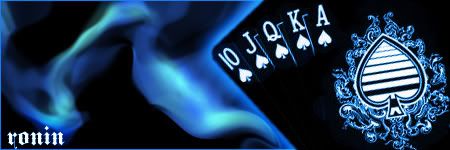
hey, i saw that other post with the cards and i thought id give it a try, since im addicted to poker anyways.
-
Whoa man, trippy effect/style you have going there. I like it simplicity of it. Maybe make the edges of each card a little more visible so you can tell they are seperate cards. Text could do with a little lowering opacity or blend change. Good job though, I'm really liking it.
-
I'd leave them to their original color, and then have the smoke effect instead... I like the smoke though, really do
-konfusion
-
-
i dislike the text. it´s too bold and too dominant.
the smoke-like effect is really good. looks unique. but it bites the outer glow of the render a bit. maybe you should have stroked the render carefully in white instead of the outer glow.
all in all it´s pretty fine.
current:

fav:

-
looks pretty cool, kinda reminds me of that movie smokin aces. but love the smoke man. And id just wiork on wat was said above.
My DevART
RATCHET is my bitch
Andrew says:
u ever stolen a bible?
Apathy says:
no
used the last two pages to roll a joint though
Andrew says:
wow
thats fucking hard core
^^HAHAHA, dm sucks XD
-
I really don't like how it's a negative.
Similar Threads
-
By blindman4556 in forum Sigs & Manips
Replies: 2
Last Post: 01-30-2007, 04:11 PM
-
By Ravon in forum Sigs & Manips
Replies: 3
Last Post: 04-03-2006, 12:56 PM
-
By Chaos in forum Member Battles Voting
Replies: 24
Last Post: 07-12-2005, 04:07 PM
Posting Permissions
- You may not post new threads
- You may not post replies
- You may not post attachments
- You may not edit your posts
-
Forum Rules
|