0 members and 10,660 guests
No Members online

» Site Navigation

» Stats
Members: 35,442
Threads: 103,075
Posts: 826,688
Top Poster: cc.RadillacVIII (7,429)
|
-
04-20-2007, 11:56 PM
#721

It's not bad.
The filters over the render are a bit much and take away from it, so lighten those a little maybe. Good render placement. Try using some new abstract brushes and get a little behind the render, and make it stand out.
Good job.
-
04-21-2007, 07:22 AM
#722

.HaVoC.: Loved by none, hated by many
-
04-21-2007, 06:24 PM
#723
1st ones nice havoc. Second is a little too grungy for my taste. Good job though, and text is very plain and simple.
-
04-21-2007, 07:03 PM
#724
 it's rate for a reason.. nobody's been rating lolz. Comments are good but i like gettin mine rated. it's rate for a reason.. nobody's been rating lolz. Comments are good but i like gettin mine rated.
8/10 Because of the black thing on the right and because its kinda messy.
9/10 Because the border is evenly distributed on this one at least.
9.99999999/10 Because it doesnt have a border... or at least the border isn't visible enough.
Fave:
~~-Gift from a friend-~~
-
04-21-2007, 09:29 PM
#725
kind of plain. 8/10
nth much 7/10
.HaVoC.
.HaVoC.: Loved by none, hated by many
-
04-21-2007, 10:38 PM
#726
1st - not very good text, but the bg is cool and the render blending isnt bad. 8/10
2nd - the colors of the bg throw me, the render's blending isnt all that great , the txt stands out a little to much for me, btu it isnt a bad sig. 6/10.
 My DevART
RATCHET is my bitch
Andrew says:
u ever stolen a bible?
Apathy says:
no
used the last two pages to roll a joint though
Andrew says:
wow
thats fucking hard core
^^HAHAHA, dm sucks XD
-
04-21-2007, 11:13 PM
#727
-
04-22-2007, 02:10 AM
#728
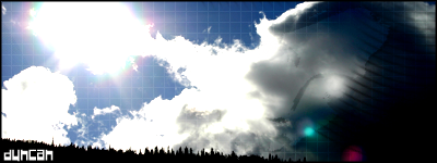
the shadow on the right looks really wrong, but it might work if put it at an angle instead of straight horizontal. also the shape, while a bit more interesting than the standard rectangle, doesn't fit the shape of the render very well, so it leaves all those awkward empty spaces. the render itself looks pretty good, and it's an interesting effect, but that alone isn't enough to make good. trey not to get discouraged though, i like that you're trying out different styles, keep playing around with it, and keep asking yourself why something does or doesn't work.
6/10
.

-
04-22-2007, 06:22 AM
#729
er...hmm....blending could be improved, like the colors though.
6.78658765/10. Don't like the text >< (text nazi)
About your comment on my sig(s): It's supposed to look rough around the edges - I wanted it to look like a painting or a drawing, not like a digital picture... And I wanted it to look like there is a wall with an explosion behind him, and a wall where smoke is coming out. It's not your ordinary smudge sig (I hate it when people under-credit me for my work. I did do something different! :P)
-konfusion
-
04-22-2007, 07:46 AM
#730
Similar Threads
-
By SgtSwabs in forum The Void
Replies: 16
Last Post: 12-06-2005, 08:42 PM
-
By LunarPoet in forum Sigs & Manips
Replies: 1
Last Post: 06-23-2005, 12:31 PM
-
By Xavier in forum Sigs & Manips
Replies: 8
Last Post: 06-03-2005, 01:46 AM
 Posting Permissions
- You may not post new threads
- You may not post replies
- You may not post attachments
- You may not edit your posts
-
Forum Rules
|


 Reply With Quote


![[PHXN] New001's Avatar](image.php?u=7015&dateline=1264038258)
![Send a message via Yahoo to [PHXN] New001](http://www.gfxvoid.com/forums/images/misc/im_yahoo.gif)