0 members and 636 guests
No Members online

» Site Navigation

» Stats
Members: 35,442
Threads: 103,075
Posts: 826,688
Top Poster: cc.RadillacVIII (7,429)
|
-
04-22-2007, 07:54 AM
#731
-
04-22-2007, 08:01 AM
#732
-
04-24-2007, 04:51 PM
#733

First- 9/10 LOVE IT!!!!
Second- 7/10 The render doesn't fit in for me.
Fave:
~~-Gift from a friend-~~
-
04-24-2007, 06:07 PM
#734
1st: 7.5/10
2nd: 8.8/10
I like the second one better...I like the effects and lightings.
-
04-24-2007, 06:29 PM
#735
5/10 Don't like the filter on it and the text is just slapped on the picture.
-
04-24-2007, 06:37 PM
#736
meh...need to work on lighting, render blur is a little too strong.
6.5/10.
-
04-24-2007, 07:59 PM
#737
huh...its different, give ya that. I dont much care for the rainbow coloring style, but I guess thats what sets this apart from others of this style. 7.0012/10
-
04-26-2007, 12:11 AM
#738
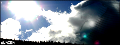
5.5/10...there's a bright light on the right side...on the bottom right corner....it's very irritating. and on the bottom left, it says avatar...but it's blurred too much. just fix it up a bit...and by his hand, it says something, but I can't tell.
-
04-26-2007, 10:59 AM
#739
-
04-26-2007, 04:50 PM
#740
Similar Threads
-
By SgtSwabs in forum The Void
Replies: 16
Last Post: 12-06-2005, 08:42 PM
-
By LunarPoet in forum Sigs & Manips
Replies: 1
Last Post: 06-23-2005, 12:31 PM
-
By Xavier in forum Sigs & Manips
Replies: 8
Last Post: 06-03-2005, 01:46 AM
 Posting Permissions
- You may not post new threads
- You may not post replies
- You may not post attachments
- You may not edit your posts
-
Forum Rules
|


Originally Posted by Duncan


 Reply With Quote