0 members and 1,627 guests
No Members online

» Site Navigation

» Stats
Members: 35,442
Threads: 103,075
Posts: 826,688
Top Poster: cc.RadillacVIII (7,429)
|
-
05-14-2007, 05:27 AM
#811

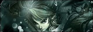
like it 8/10
dont be too mean when judging mine... im still new... And i made this abt 2 months ago.
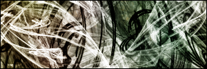
.:Yep it sucks, but my best so far, I like abstract:.
(\__/) (='.'=) (")_(")
Help The bunny ^^ acheive World Domination Ctrl + C it and then Ctr + V it into your sig.
-
05-14-2007, 09:55 AM
#812
-
05-14-2007, 11:20 AM
#813
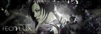
7.8I like it.I think you should try and get the lines off her face, and kinda make her blend with the design, it looks more llike she is in front of it.
r3vamped:Favorite Sig
r3vamped: Latest Sig
-
05-14-2007, 01:04 PM
#814
-
05-15-2007, 04:30 AM
#815
8.3/10 - I don't like the weird yellow line on the left, but apart from that it's great!
7.9/10 - not that much of a fan of it...
RATE this please

-konfusion
-
05-15-2007, 06:37 AM
#816
9/10 i think it looks good
-
05-15-2007, 09:53 AM
#817
7.1/10
the pencil is 9/10...thats ballin
..The Dream.
SOTW #73 Winner
-
05-15-2007, 11:19 AM
#818
9/10
from gunzfactor aye?
.:Yep it sucks, but my best so far, I like abstract:.
(\__/) (='.'=) (")_(")
Help The bunny ^^ acheive World Domination Ctrl + C it and then Ctr + V it into your sig.
-
05-15-2007, 01:34 PM
#819
7.7
I like the abstract. Keep it up
r3vamped:Favorite Sig
r3vamped: Latest Sig
-
05-15-2007, 01:40 PM
#820
7.95/10 Icky scanlines, but it's a good sig with some nice text.
9.81/10 It's really good nothing I don't like about it.
Fave:
~~-Gift from a friend-~~
Similar Threads
-
By SgtSwabs in forum The Void
Replies: 16
Last Post: 12-06-2005, 08:42 PM
-
By LunarPoet in forum Sigs & Manips
Replies: 1
Last Post: 06-23-2005, 12:31 PM
-
By Xavier in forum Sigs & Manips
Replies: 8
Last Post: 06-03-2005, 01:46 AM
 Posting Permissions
- You may not post new threads
- You may not post replies
- You may not post attachments
- You may not edit your posts
-
Forum Rules
|


 Reply With Quote


![[PHXN] New001's Avatar](image.php?u=7015&dateline=1264038258)
![Send a message via AIM to [PHXN] New001](http://www.gfxvoid.com/forums/images/misc/im_aim.gif)
![Send a message via MSN to [PHXN] New001](http://www.gfxvoid.com/forums/images/misc/im_msn.gif)
![Send a message via Yahoo to [PHXN] New001](http://www.gfxvoid.com/forums/images/misc/im_yahoo.gif)


