0 members and 6,675 guests
No Members online

» Site Navigation

» Stats
Members: 35,442
Threads: 103,075
Posts: 826,688
Top Poster: cc.RadillacVIII (7,429)
|
-
05-16-2007, 09:58 AM
#831

 Originally Posted by Tastyfish

7.5/10
i kinda like your sigs.
but i do think its beacuse i like abstract.
dont think its really personal, but its cool anyway  .
youve made my day 
youre sig is nice, its a bit like the stuff you would see in a quicksilver tag or on a surf board without that stock lol... 8/10
.:Yep it sucks, but my best so far, I like abstract:.
(\__/) (='.'=) (")_(")
Help The bunny ^^ acheive World Domination Ctrl + C it and then Ctr + V it into your sig.
-
05-16-2007, 01:35 PM
#832
7.5
Nice sig.
A tutorial o.O, I've never made one before, i could give it a try though. Not much to it really.
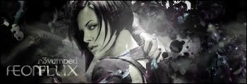
r3vamped:Favorite Sig
r3vamped: Latest Sig
-
05-16-2007, 01:56 PM
#833
8.9/10 - a tad over contrasted, could do with better lighting
7.8/10 - text isn't that good imo, and the colors aren't too soothing to my eyes.
-konfusion
-
05-16-2007, 02:15 PM
#834
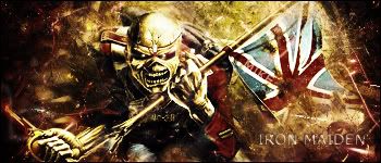
9/10 very simple and good (or as ez would call it, "just a picture with some text is that even rateable?") I love the text too...
7.9/10 Sorry not a fan, i'm sure there are other people who may like it, but it's too grungy for me, i'm really not a fan of the bg or the style in which the stock comes out of the sig itself.
Fave:
~~-Gift from a friend-~~
-
05-16-2007, 02:27 PM
#835
As i said before i love that hockey sig, gotta be like 10/10, totally love it.
The shrek sig is good but there is those sudden lines etc vich i really dont think fits in there but it looks like thats the thing you wanted (maybe not) so i gotta give it 8/10
-
05-16-2007, 02:32 PM
#836
7/10 - monotone, no border, needs a bit of work
PS: @shane - the stock: 
-konfusion
-
05-16-2007, 07:29 PM
#837
9/10
I like the dim lighting feel to it, and yet simplistic. Nice sig
8.5
Like the idea, the only think im not too fond of is the BG color. its prolly just me though.
r3vamped:Favorite Sig
r3vamped: Latest Sig
-
05-16-2007, 09:22 PM
#838
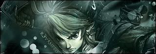
Vamped:
I love link. ubt the light source needs some work imo.
6/10
I really like the colors and style of the 2nd one. 7.8/10
-
05-17-2007, 08:55 PM
#839
i like the effect, text could use some work
7.9/10

What You expect?
Condems?
-
05-18-2007, 01:57 AM
#840
text needs major work....nice effect...except the whole thing doesn't come together well...maybe need a more raw background...
6.5/10
..The Dream.
SOTW #73 Winner
Similar Threads
-
By SgtSwabs in forum The Void
Replies: 16
Last Post: 12-06-2005, 08:42 PM
-
By LunarPoet in forum Sigs & Manips
Replies: 1
Last Post: 06-23-2005, 12:31 PM
-
By Xavier in forum Sigs & Manips
Replies: 8
Last Post: 06-03-2005, 01:46 AM
 Posting Permissions
- You may not post new threads
- You may not post replies
- You may not post attachments
- You may not edit your posts
-
Forum Rules
|


 Reply With Quote