GFXVoid Graphic Design Forum

Remove Text Formatting
Loading...

» Online Users: 4,853

0 members and 4,853 guests
No Members online

» Site Navigation

 > FAQ

» Stats

Members: 35,442
Threads: 103,075
Posts: 826,688
Top Poster: cc.RadillacVIII (7,429)
Welcome to our newest member, Lekelindids
Results 1 to 2 of 2

Thread: Ronin sig

  1. #1
    Join Date
    Mar 2007
    Location
    Cali
    Posts
    372

    Default Ronin sig


    vrs 2


    vrs3


    c&c please.
    Last edited by RONIN; 05-27-2007 at 04:24 AM.

  2. #2
    Join Date
    Dec 2005
    Location
    Somewere in Azeroth...
    Posts
    82

    Default

    i like tthe 1st and 2nd, the third i dont like it cause of the drops u placed ,thou it is a nice idea)
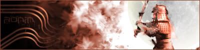
    Now in 1st why u dont try to make the text more clear...
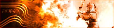
    in 2nd i like the colours better becuase the image combines better with the samurai...thats my opinion...
    Also something that ive noticed on 3 of them is the small spot that u have in right bottom corner, its a bit annoying...xD

    Biohazard

Posting Permissions

  • You may not post new threads
  • You may not post replies
  • You may not post attachments
  • You may not edit your posts
  •  
Powered by vBadvanced CMPS v4.1.1