er..CnC please? renovation
[SUPERMAN]
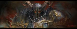
to dark, otherwise good
http://joshstudt.deviantart.com/
too dark, too much negative space, the text just kills the render, and not enough contrast. good render however, but you should definatly make it feel more interesting.
Undertone got most of it. Just do what he said it'd be real good.
My DevART RATCHET is my bitch Andrew says: u ever stolen a bible? Apathy says: no used the last two pages to roll a joint though Andrew says: wow thats fucking hard core ^^HAHAHA, dm sucks XD
there's a lot of open space there you gotta fix that up i say minimize the size width to 415
Joga TVSrgtSplattersGFX.com
thanks guys. time for some editting EIDT:
Last edited by jorrne; 06-16-2007 at 07:59 PM.
Oh wow.. I like the updated one.. The text is bad though.. That would be the only thing I'd want to see changed or better.. Nice work!
i would like to see the green be a little stronger... and that text still hurts the image.
changed the text. a little greener.
awesome, cant think of much else to improve right now.
Forum Rules


 Reply With Quote