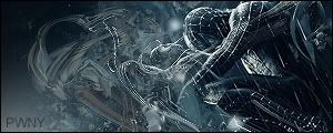
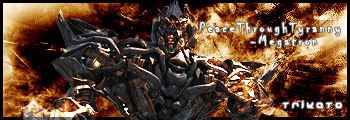
Well Here Are Two Sigs I Made After Seeing The Transformers Movie. Any Improvements Please Tell Me. And If You Know A Good Tut I Should Look Over Please Post. I'm Trying To Get WAY Better So I need All The Help I Can Get. Well Here They Are.
|
|


Loading...
|
» Online Users: 26,370
|
Results 1 to 4 of 4
Thread: Transformer Sigs
Similar Threads
|


 Reply With Quote