GFXVoid Graphic Design Forum

Remove Text Formatting
Loading...

» Online Users: 6,547

0 members and 6,547 guests
No Members online

» Site Navigation

 > FAQ

» Stats

Members: 35,442
Threads: 103,075
Posts: 826,688
Top Poster: cc.RadillacVIII (7,429)
Welcome to our newest member, Lekelindids
Results 1 to 6 of 6

Thread: hercules.

  1. #1
    Join Date
    Jun 2007
    Location
    Malaysia
    Posts
    568

    Default hercules.

    I think it's hercules..


  2. #2
    Join Date
    Mar 2007
    Location
    Denmark
    Posts
    4,197

    Default

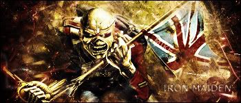
    This is a very good sig, i say darken the left side of the sig a bit. other than that very nice job


  3. #3
    Join Date
    Feb 2007
    Location
    American by birth, southern by the grace of God.
    Posts
    2,564

    Default

    its a nice sig, but to bright IMO

  4. #4
    Join Date
    Jun 2007
    Location
    Malaysia
    Posts
    568

    Default

    darker on the left

  5. #5
    Join Date
    Mar 2007
    Location
    Denmark
    Posts
    4,197

    Default

    Better, again nice


  6. #6

    Default

    I agree, darken the left out a bit. Too much open space
    \ \ + + M I K E + + / /


Posting Permissions

  • You may not post new threads
  • You may not post replies
  • You may not post attachments
  • You may not edit your posts
  •  
Powered by vBadvanced CMPS v4.1.1