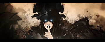
Dont mind rai here he has a way of saying thing harsh. Well this sig needs majour work im afraid i have to say. The bg needs to be worken some more on. Also the renders seems kinda small and pixelated the whole sigs could use some effects. And the text is to big and not so good placed- I would say try to read some tuts here on the void. i have 5 very beginner friendly tuts.


 Reply With Quote