GFXVoid Graphic Design Forum

Remove Text Formatting
Loading...

» Online Users: 1,420

0 members and 1,420 guests
No Members online

» Site Navigation

 > FAQ

» Stats

Members: 35,442
Threads: 103,075
Posts: 826,688
Top Poster: cc.RadillacVIII (7,429)
Welcome to our newest member, Lekelindids
Page 1 of 2 12 LastLast
Results 1 to 10 of 11

Thread: Hello all...

  1. #1
    Join Date
    Oct 2007
    Posts
    6

    Default Hello all...

    Heya all ,

    I'm with a Halo PC clan and I found a link on our forums from a member where he got a tutorial from, so I decided to come here

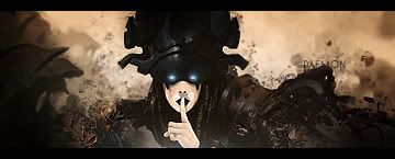
    I'm not THAT good with Sigs really...but here's one I made earlier today...


    C & C please

    Selene<.>Mary w/e you want to call me I don't care.

    Thanks.
    Last edited by Selene; 10-07-2007 at 07:06 AM.

  2. #2
    Join Date
    Mar 2007
    Location
    Oslo, Norway
    Posts
    1,509

    Default

    I like it... Still something weird about the render. Dunno what. Maybe the very light spots. Interesting bg. Decent text. Lower the opacity a bit maybe. Not to bad placement though.

    Formerly known as silentshadow
    http://flickr.com/aeilertsen

  3. #3
    Join Date
    Feb 2007
    Location
    American by birth, southern by the grace of God.
    Posts
    2,564

    Default

    Lower the opacity of the render, make the render stand out a little more, and make the text blend in to the bg a little more other than that its no that bad of a sig.

  4. #4
    Join Date
    Mar 2007
    Location
    Denmark
    Posts
    4,197

    Default

    I would say lower some of thet gaussian blur Lighten thingy and make therender stand out some more. Needs a border. nice job for someone new though.


  5. #5
    Join Date
    Aug 2007
    Location
    Philippines \m/
    Posts
    331

    Default

    Sharpen it and lower the opacity of the text


    Proud Member Of MasterWorks® Family

  6. #6
    Join Date
    May 2007
    Posts
    379

    Default

    Quote Originally Posted by Brahma View Post
    Sharpen it and lower the opacity of the text
    Agreed.

    Sharpen render.
    Add some depth.
    Add a border.
    Fix your focal point.

    "Judge a man by his questions,
    not his answers."
    -Voltaire


  7. #7
    Join Date
    Oct 2007
    Posts
    6

    Default

    1) Sharpening render didn't look good
    2) It's not as simple as saying "add some depth" i've not been at this long so someone will have to teach me .
    3) Forgot the border my bad there
    4) Focal point...?


  8. #8
    Join Date
    Sep 2007
    Location
    Under your bed.
    Posts
    95

    Default

    Its alright, you need a little more practising!

  9. #9

    Default

    blend the render more, and i think it would be ok
    New


    Old


  10. #10
    Join Date
    Nov 2006
    Location
    England
    Posts
    84

    Default

    Good start if your new to sig making, personally I would remove a load of those light spots try and keep it simple go from dark to light then sharpen the render(pic) that should give u more of a focal point....best advice i got is start simple and build up, many times ive started with a lot going on and u got nothing to build on....You are doing better than i did when i 1st started and joining this forum was a good move after I joined my sig making got a lot better just learn to take on board what other says even the critisms it helps a lot good luck and happy sig making
    Newest:
    Favourite:

Posting Permissions

  • You may not post new threads
  • You may not post replies
  • You may not post attachments
  • You may not edit your posts
  •  
Powered by vBadvanced CMPS v4.1.1