0 members and 5,429 guests
No Members online

» Site Navigation

» Stats
Members: 35,442
Threads: 103,075
Posts: 826,688
Top Poster: cc.RadillacVIII (7,429)
|
-
10-16-2007, 08:48 AM
#1201

6/10
9/10
It's pretty unique i really like it
-
10-16-2007, 09:30 AM
#1202
4/10 cant see whats the focal point.
5/10 the bg and text both need work and your render is blurred
-
10-16-2007, 09:31 AM
#1203
9/10, makes me drool all over
7/10, don't like the circly thing
-
10-16-2007, 09:37 AM
#1204
oh.. I like the look, but the border looks strange to me and car need to move up.... also need work with text and those pattern lines really district me... so:
8/10 is the whole look -1 for bad border; -0,5 for text; -1 for lines and -1 becouse details with can and bg needed so...
4,5/10 I think its a fair result...
-
10-16-2007, 09:44 AM
#1205
-
10-16-2007, 01:14 PM
#1206
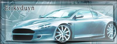
For Erik:
Background i think fits the car, colours are really nice, but make your border a bit thinner, and i think it will look good. Remove the scanlines fomr the whole sig, and cut the white outline on the text, and lower the opacity on the text.
5/10
-
10-16-2007, 03:45 PM
#1207
9/10
simply luv it
good job
-
10-16-2007, 05:46 PM
#1208
lol i already rated those signatures blackhawk =P but ill do it again (BTW NSR on the second one, there is no focal, its an abstract no render etc) (on the first one i know i messed up, so yeah) blackhawk 6.9/10 8/10
:Latest:

:Favorite:

-
10-16-2007, 06:17 PM
#1209
6/10
8/10
i like the colors in the 2nd one
-
10-16-2007, 07:32 PM
#1210
6.8/10, too much ripple IMO, and all the stuff is going in one direction, and up towards the eear its blended too much, its okay splatttering, looks like lava, i cant do it, at least with this shitty photoshop i got
:Latest:
:Favorite:
Similar Threads
-
By SgtSwabs in forum The Void
Replies: 16
Last Post: 12-06-2005, 08:42 PM
-
By LunarPoet in forum Sigs & Manips
Replies: 1
Last Post: 06-23-2005, 12:31 PM
-
By Xavier in forum Sigs & Manips
Replies: 8
Last Post: 06-03-2005, 01:46 AM
 Posting Permissions
- You may not post new threads
- You may not post replies
- You may not post attachments
- You may not edit your posts
-
Forum Rules
|


 Reply With Quote


 |
| |
| |
| |
| |
| |
| |
|") |
|