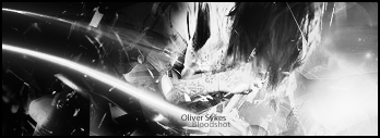
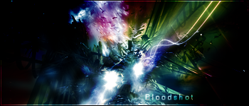
I like it. its pretty good, maybe try some different photofiltering and gradient maps and i like the effect of like the fiery looking background with the guy running out of it, but like... the render is maybe a tad too big, plus it could use a little blending near the back hand (or axe whatever it is) cuz it pops out too much, and the text could be placed maybe a little different and make it smaller, its an overall good sig
OH YEAH!! dont forget a border ^^
keep up the awesome work


 Reply With Quote